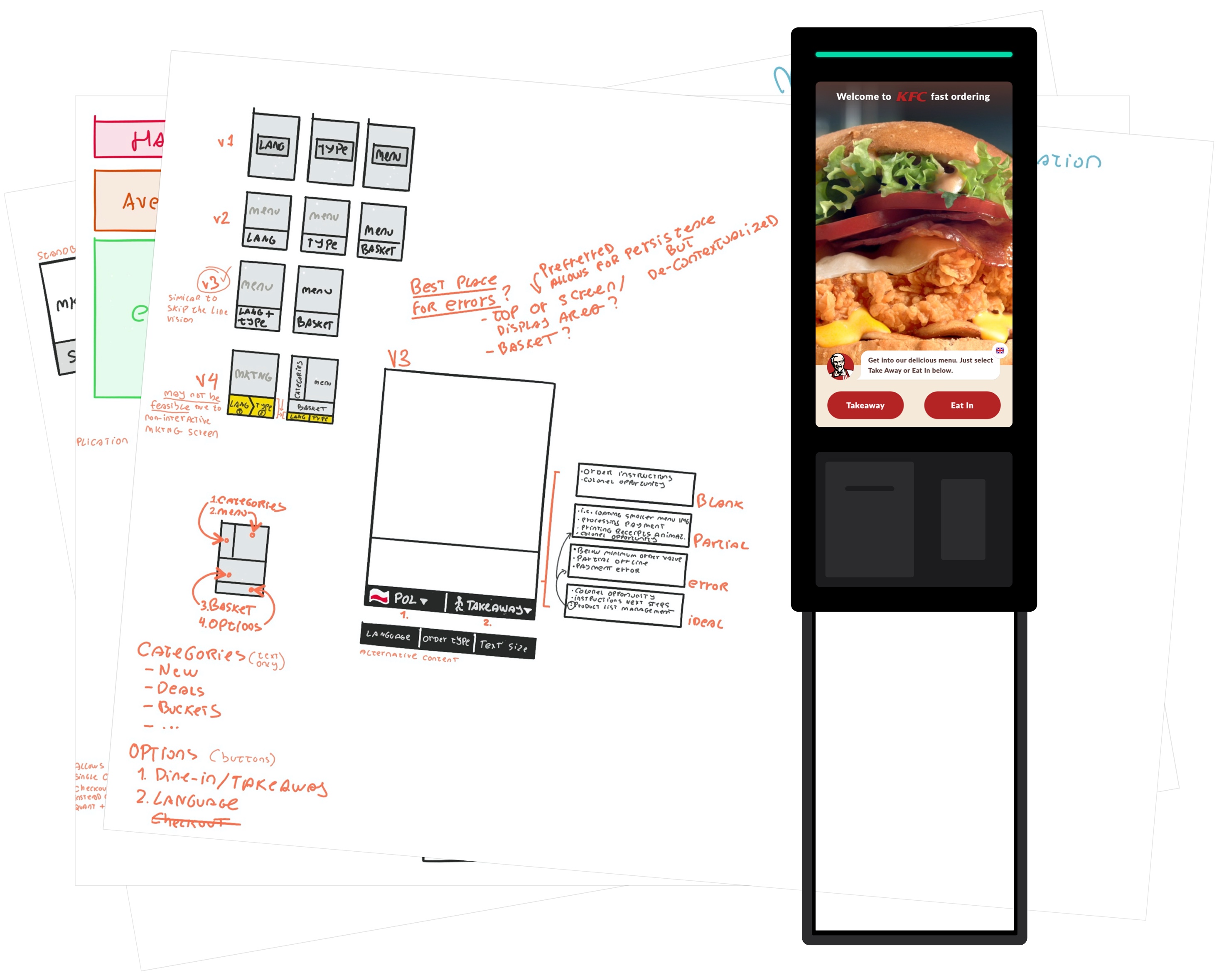
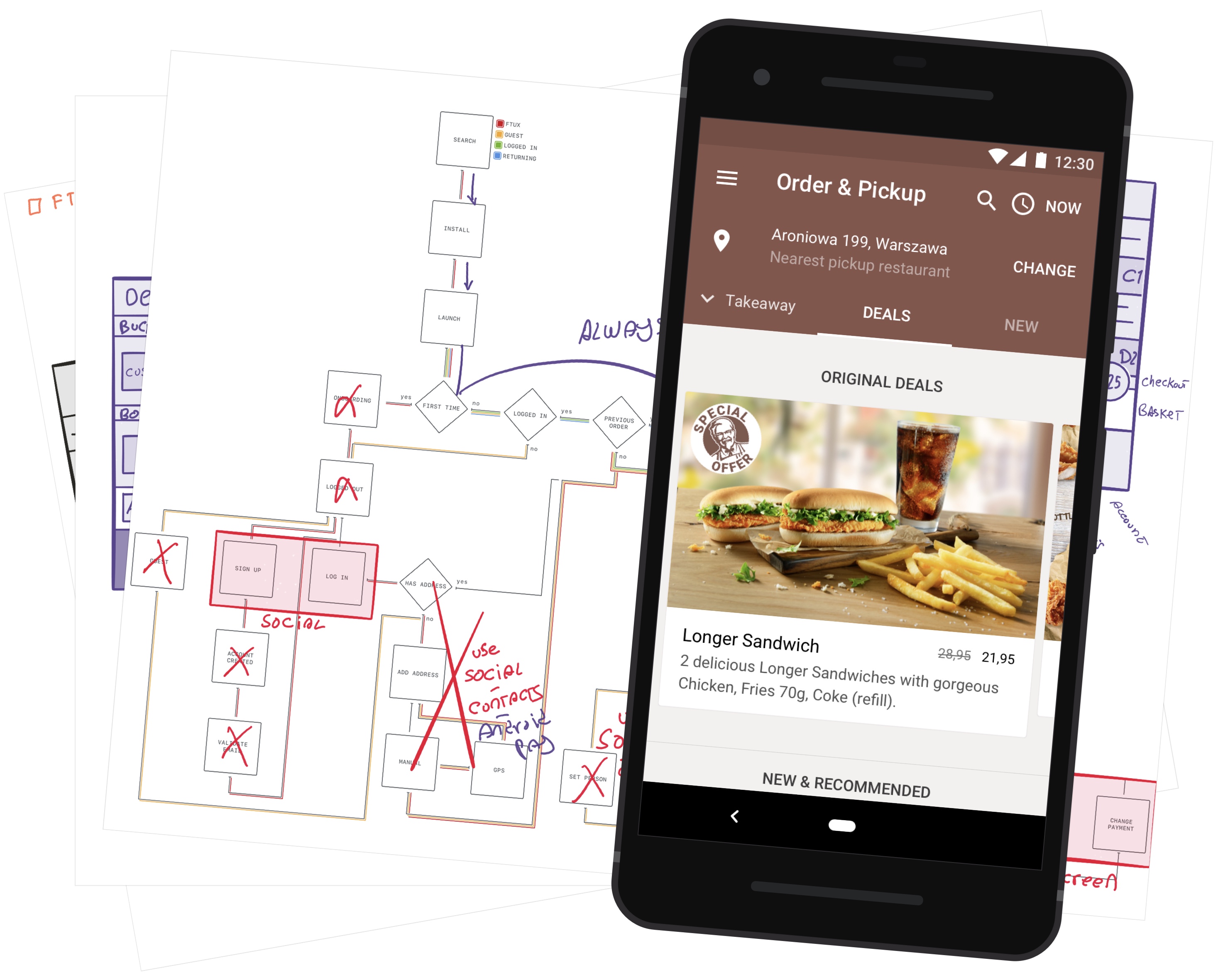
In Kathy Sierra’s 2012 presentation “Building the Minimum Badass User”, Kathy explains why we should be designing for the post-UX UX.
“People don’t use your product because they like the product or business, they use it because they like themselves.” (Kathy Sierra, Building the Minimum Badass User)
Users like you when they feel badass after using your product. It’s “Maker of Killer Photos” not “Killer at Instagram”, “Badass Cook” not “Badass at Yummly”.
Badass users will impress others and let their friends know what app made them badass, they’ll be more forgiving of imperfections and use your app more.
I definitely recommend watching the hour-long presentation as it explains very well something that companies like Apple have been doing since their inception and yet it’s so hard for others to follow.
How not to do it
Many companies design to reach the highest number of users possible. That’s hard, but it’s even harder to make them all feel badass at the same time.
A wider audience has a wider variety of problems to solve, tasks to achieve, platforms to support, but our resources and time are limited.
To serve runners, cyclists, and snowboarders you may end up just measuring distance but skip important pre, during, and post-workout guidance to prevent injuries or improve performance. To save time adapting navigation to each supported platform, you may come up with a Hamburger Menu (bad idea™).
Badass Users, Expert Users
Badass users are expert users, they consistently, reliably, and repeatably make the best choices. Not because they have a lot of experience and knowledge, but because they have the right experience and knowledge.
And that’s where we can help, learning to make the best choices happens when “attention is focused … by removing interference” said Tim Gallwey and repeated Alan Kay about 30 years ago.
The interference he mentions is the time spent chasing after balls, managing failure. Experts focus on game-winning tasks.
We can establish a parallel with Human-Computer Interaction, users should not spend their time recovering from errors, figuring out how or which button to press. It’s a case for intuitive interfaces and products that enable them to make expert choices.
How to do it
One way to create badass users is to have a holistic understanding of what might be preventing them from achieving their goals.
It’s to look at hardware, software, the city they live in, their culture, cognitive biases, and perhaps more depending on the goal.
Fitness Badass
If you want to be a badass runner, pre and post-workout is as important as the workout itself.
And yet how many fitness apps take that into account? So far I’ve only encountered one.
Badass Urban Commuter
Badass Urban Commuters know exactly which route to follow without effort and they always get there on time, without overpaying or getting soaked in the rain.
How many transit apps take weather into account? Up until a few days ago, probably only Citymapper, which also displays pricing, city-specific bus stop identifiers, offers great route comparison through detailed information that’s quickly browsable.
General Badassery
Ambient illumination; network; hardware; activity; human factors such as culture, attention, activity, ergonomics, expectations.
Our products don’t exist in a vacuum, they are exposed to the above elements and they can break because of them. Broken products don’t create badass users.
You might think: “Oh, user testing!” Correct but tests are only as good as the person who writes them, remember to test against real-world elements.
How to do it, again and again
“Redesign is the Essence of Design – … Don’t accept a first — or even a second — revision as final.” (Jared Sinclair, Good Design is About Process, not Product)
Holistically designed products help create badass users, but design is also about process.
The process involves understanding the problem and envisioning a solution, prototyping and testing, analyzing results and iterating.
Good design is iterative, but iterations cost time and resources.
Given our limited resources, how can we lower iteration cost? And how do we increase its value?
How to slow to a crawl
Design projects increase in complexity as they progress and it’s easy to end up with hundreds of screens.
Popular design tools like Photoshop or Sketch allow for a quick start due to their lack of structure, this quickly becomes as limiting as it was empowering.
Without structure, something as simple as changing an element’s text size can require minutes if not hours of manual updates to all screens where that element is present.
To aggravate this issue, updating documentation and prototypes is also manual work, that’s minutes or hours we could spend designing.
It’s not only the time and cost it adds to iteration but how error-prone that manual work is.
There’s a better way. It might require a mindset change but it’s a better way to achieve sustainable iteration.
How to do it sustainably
Let’s not forget our focus: creating badass users. But DVDs used to be badass, so were PDAs and the first cellphones.
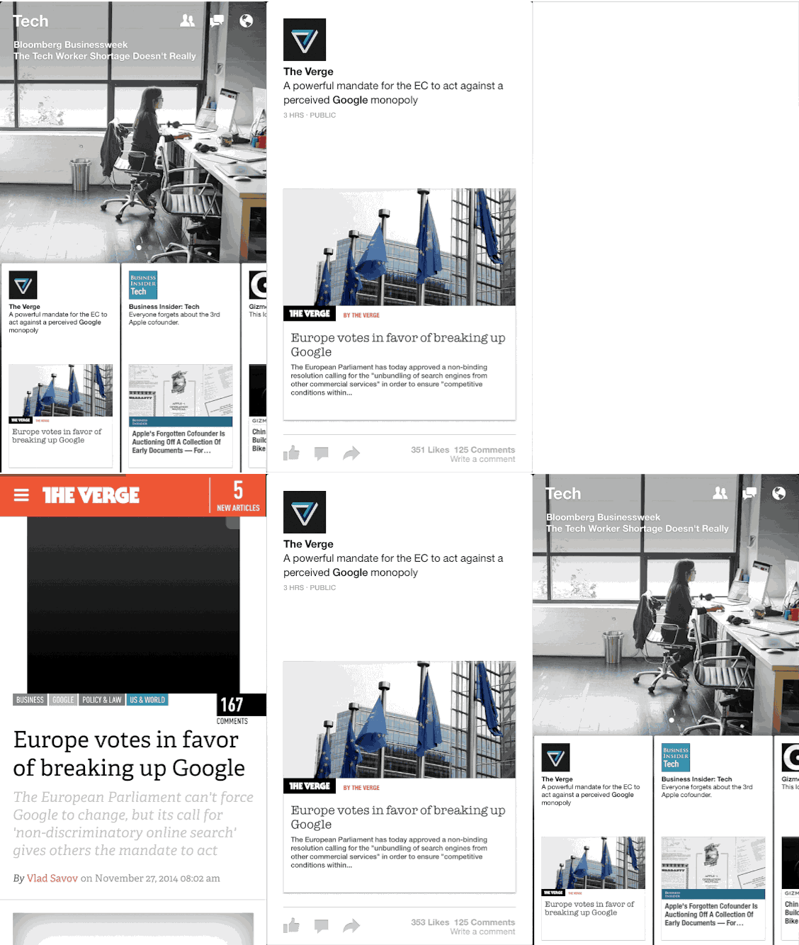
The same change happened to apps, basic non-interactive transitions used to be great but we’ve come to expect advanced interactive physics-based animations (i.e. Facebook Paper pictured above). Beyond delight, animations explain and provide feedback. Badass users aren’t confused users.
Animations are integral to our products and must be designed together, we can neither fade out a non-existing object or alter an existing one without impacting general screen layout.
This brings us to the question of iteration performance, and design tools.
It’s not that we can’t delegate prototyping to someone else, continue using Sketch or Photoshop in the way we do, documenting animations in Pixate and maintaining static prototypes in InVision.
It’s just that there’s a more sustainable way to do it.
“…we have to use prototypes, as close to the final product as possible…” — (Nicholas Jitkoff — Google Material Design, Iterate 78: Google designers talk Material Design)
For concrete examples, I’ll need to focus on a platform and ecosystem I know very well, that’s iOS. Google’s Material Design designers also follow the principles I’m about to describe, and this is also applicable if you do Web so don’t be put off.
From time to time, despite the Law of the Instrument and Hyperbolic Discounting, we change our tools and opt for long-term goals.
This usually happens when we have no other option.
User Experience gained popularity because companies had no option if they were to remain competitive.
We also have no option but to reconsider our choice of tools if we’re to keep up with user expectations, design for an increasing variety of devices while maintaining productivity.
Large and small companies are switching to using tools native to the platforms they design for. Apple, Facebook and other large players have been doing it for years.
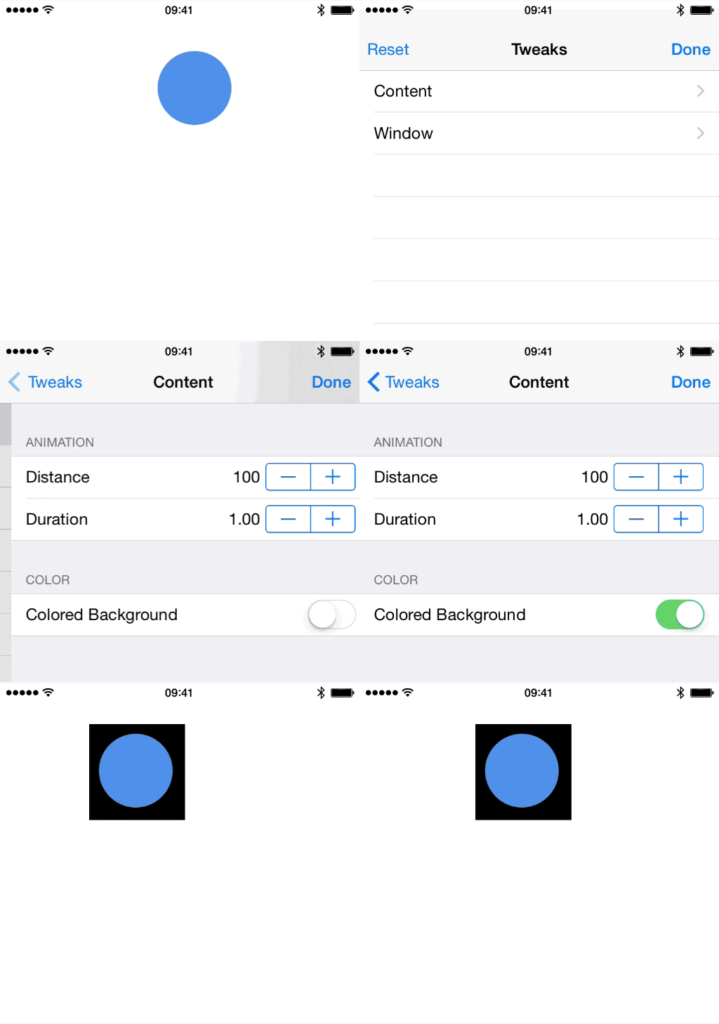
The importance of high-fidelity and iteration speed lead Facebook — in addition to using Xcode — to build a series of native tools: Origami, POP and Tweaks.
They enable designers to better communicate ideas with developers and users, early in the design cycle before it’s too expensive to change them, with the guarantee these ideas are easily tweaked and representative of the final product.
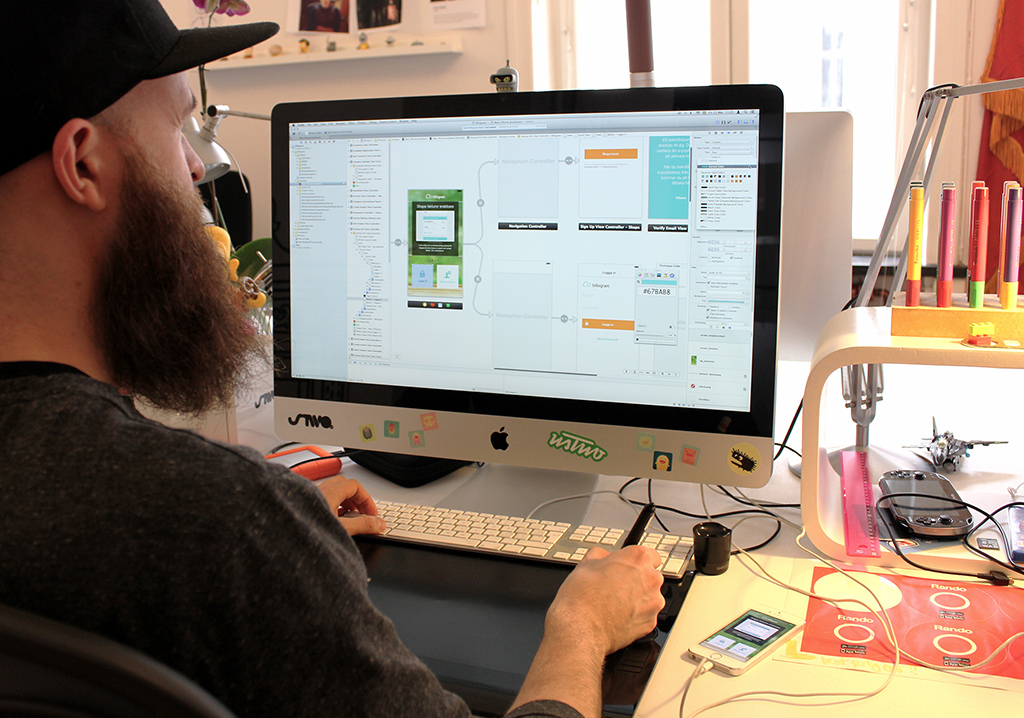
Designers — including myself — have experienced how frustrating spending too much time on maintaining documentation and prototypes is. If using PaintCode, Xcode Storyboards and Swift means we spend more of our billed time designing, count me in.
“This innovation of our workflow proved to be a real time saver and it helped push the team to become even more collaborative whilst having fun throughout the process.” (Tobias Arréhn, Designer at USTWO)
Tobias wrote about his experience using Xcode Storyboards. They improved productivity for both him and developer, eliminated miscommunication, and facilitated the exploration of new ideas straight from Xcode. They managed to release an MVP within a month, constrain really is an innovation driver.
Mathew Sanders, Product Designer at USTWO, has been writing about his experience with Accessibility, Storyboards, Animations, Transitions. His motivation is being able to represent his ideas precisely and independently.
“The difference between a regular segue and a custom segue is just a few minutes or a week of work” (David Bellona, Designer at Twitter)
David Bellona, Designer at Twitter, also shared his experience of attending CodePath to learn Xcode & Swift in iOhYes Podcast #48. To him it’s about communication, fidelity, efficient use of available time, and being able to apply the coding mental model to other situations.
People and companies definitely see value in using more native tools, it’s interesting that some learning materials are created by designers (i.e. Meng To’s Design+Code, Scott Hurf’s Xcode for Designers).
Conclusion
Creating badass users makes products truly and sustainably desirable. A user can’t be badass if there’s interference in the way, holism helps us understand what it might be. Native tools help our design process by improving communication, iteration speed, and individual team member performance.
Despite the interest and investment from hundreds of individual designers, public stories from small and large companies, there are still challenges to overcome.
The hardest challenge is to clarify for team leaders and members why this mindset change is worth the investment. This blog post should help in that sense and I understand it’s a complicated matter.
You’re more than welcome to share this post and provide constructive feedback on Twitter. If you’re looking to learn more about using Native Tools like Xcode on one-on-one or small group workshops feel free to ping me your details.
Credits
Thanks to Mathew Sanders for his availability and feedback on this article.
Photo of “Designer and Xcode” by USTWO, in Billogram Story


