Contextual Menus work on iOS, iPadOS, and macOS via Catalyst
The drive for consistency across apps, platforms, and devices impacts iOS 13 in many ways.
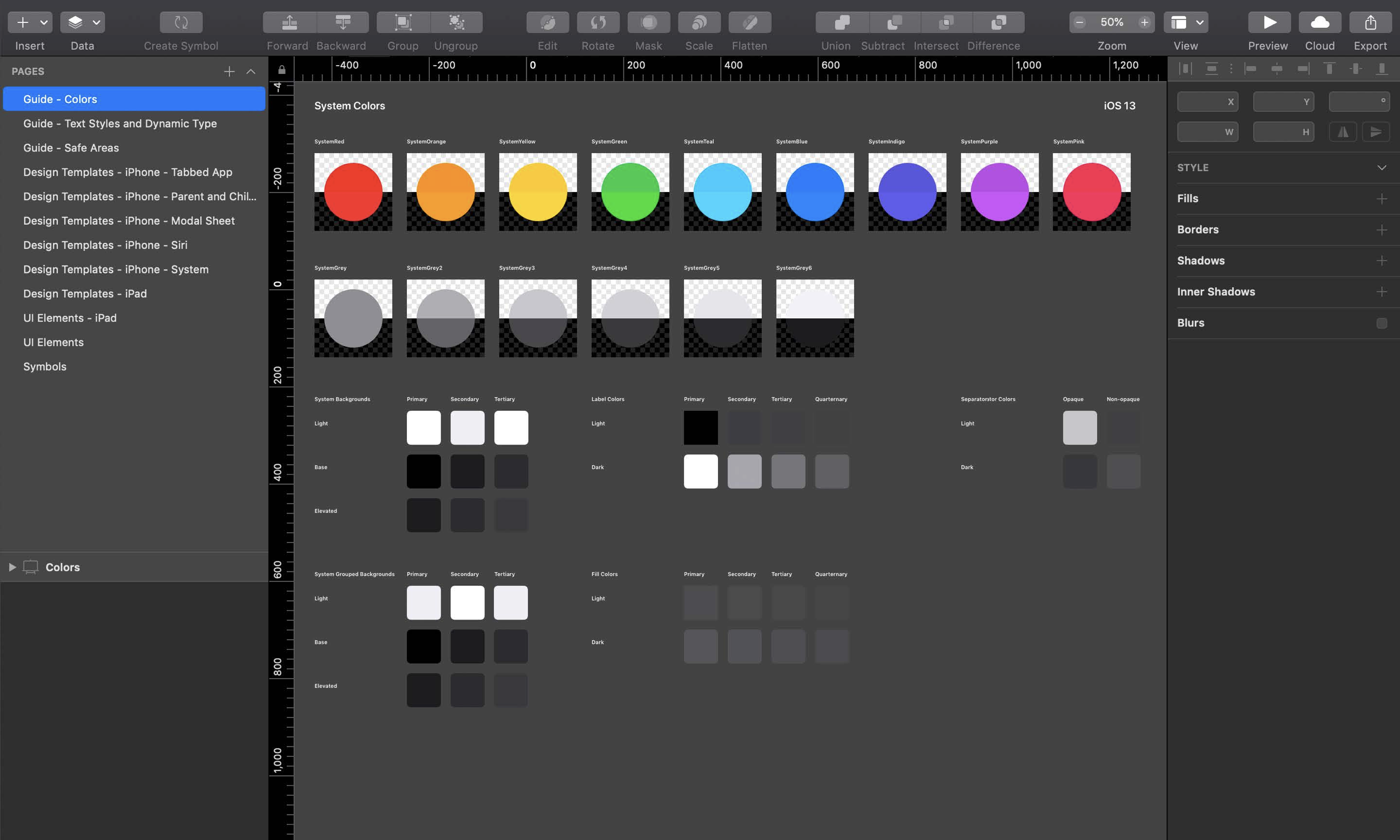
A screenshot of the iOS 13 Design System sketch file
The new iOS 13 Design System helps Apple and third parties build apps consistent with one another. SF Symbols are perhaps the most important part of the iOS 13 Design System, they’re a set of 1500+ icons free for any app to use, as a result, you won’t have to re-learn what the common archive, directions, or delete icons look like when you use a new app.

The value of the iOS 13 system blue colour changes to a higher contrast value when the increased contrast accessibility setting is enabled.
As with many other built-in Apple technologies, the new Design System colours, materials, fonts, and SF Symbols automatically adapt to dozens of accessibility settings, so you don’t have to work harder to build the accessible apps your users expect.
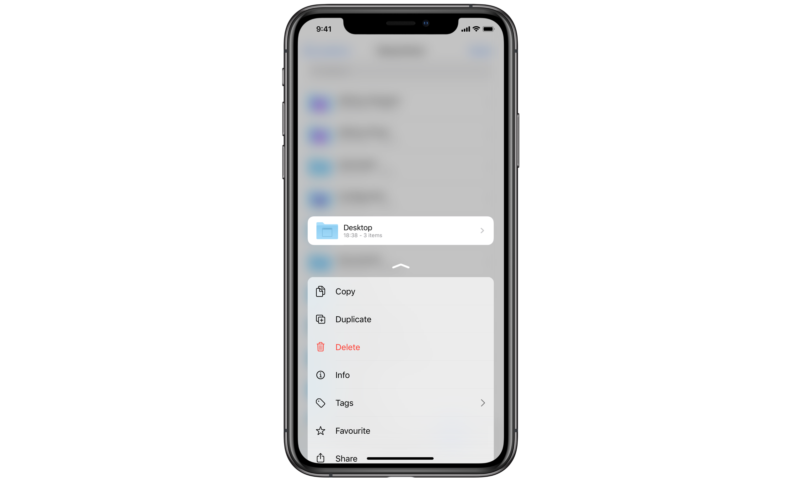
Contextual Menus
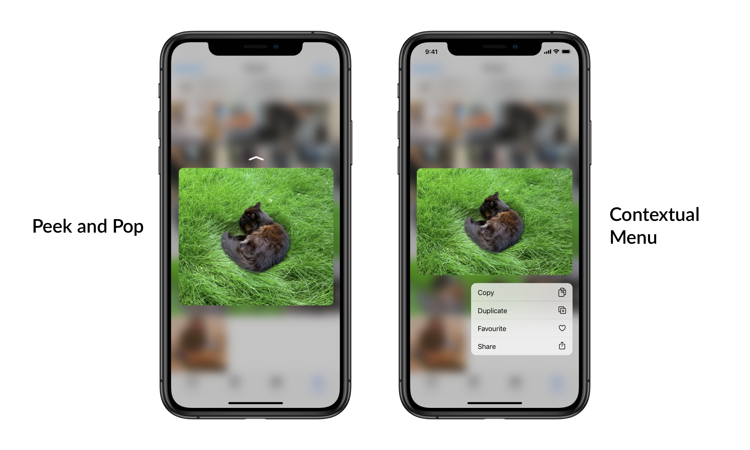
Peek & Pop vs Contextual Menu.
Contextual Menus are new in iOS 13, they’re a touch-screen friendly version of the macOS contextual menus, with a layout that improves upon Peek & Pop by showing actions alongside content previews.
It’s important to note that they are what’s called an accelerator, something advanced users (20%) can take advantage of to speed up their workflow and should not be the way most users (80%) use your app.
By using a long-press gesture instead of 3D Touch for their invocation, Contextual Menus are available on iOS, iPadOS, and tvOS devices. On 3D Touch-enabled devices, applying extra pressure shortens the duration of the long-press gesture.
As with macOS, contextual menu actions now support child actions and dividers. Outside the Mac (except for Catalyst), each action may have an associated icon.
Pros and Cons
Pros
Cross-platform availability is both a pro and requirement given that Catalyst apps must aim to present the same feature-set when running on iOS (touch) and Mac (pointer).
Actions discoverability is another pro, previously with Peek & Pop, users who didn’t think of swiping up, weren’t aware of the extra functionality. Same goes for the horizontal swiping that allowed users to activate one of two actions with a quick gesture.
Cons
Efficiency has definitely been compromised in favour of cross-platform availability and actions discoverability, this is the first con.
Both Peek & Pop as well as Contextual Menus allow for: 1. invocation, 2. dismissal, 3. accessing content detail, 4. activating actions.
In Peek and Pop (3D Touch), 1. previewing content is done in 250ms, 2. dismissal in 200ms, 3. accessing content detail in 400ms, 4. And performing an action after previewing in 150ms.
Measured by analysing a screen recording.
The equivalent without 3D Touch takes 1. 300ms, 2. 500ms, 3. 1000ms, and 4. 20ms – actions are immediately accessible after previewing.
Contextual Menus are slower not just because they rely on long-pressing, but also because switching from previewing to any other action requires users to physical raise, re-orient, and lower their fingers to then perform a tap or swipe gesture.
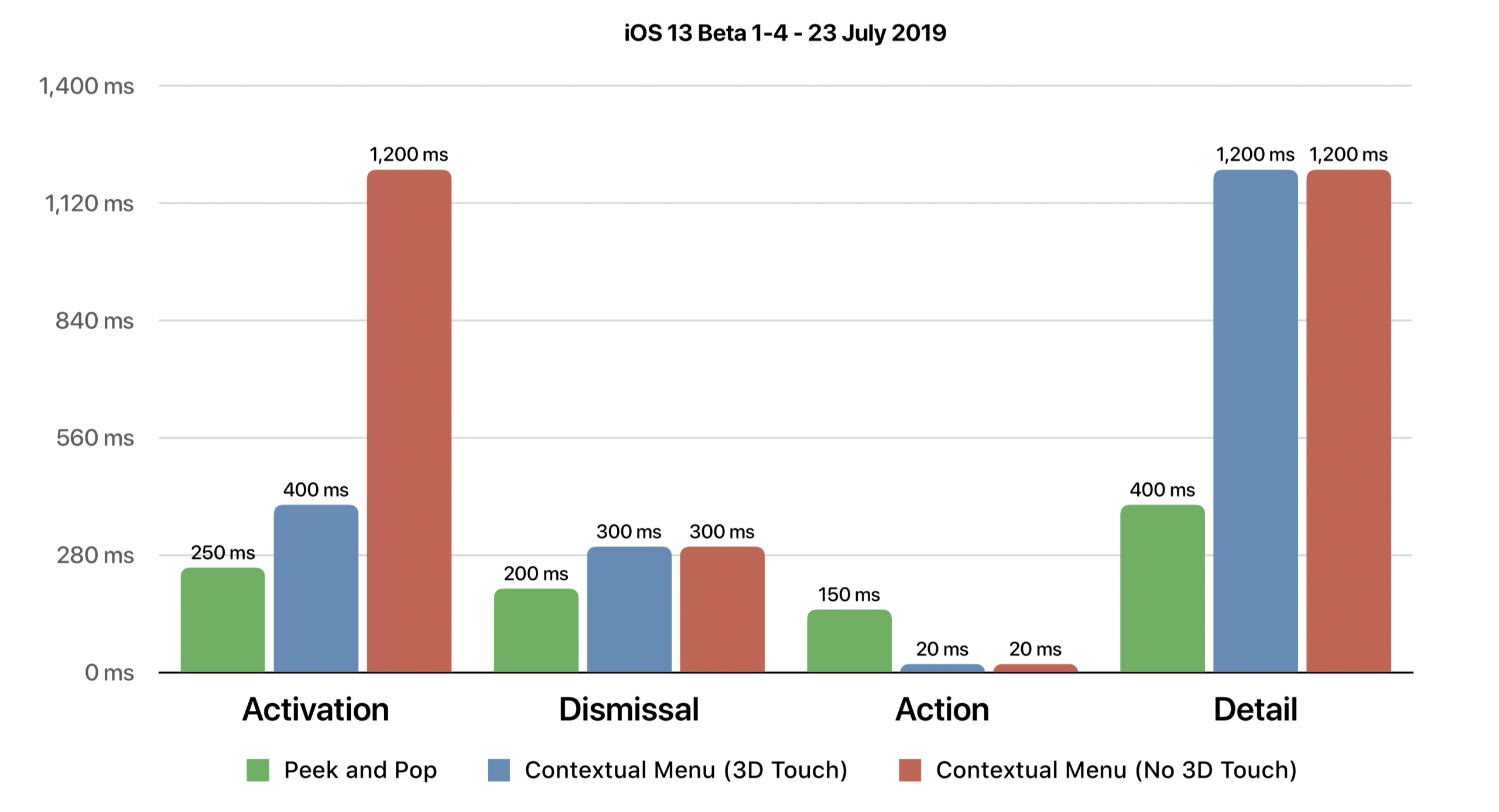
Timings for Peek & Pop vs Contextual Menu, 23 July 2019
Animations not only slower, but more complex. For example, accessing content detail with Peek & Pop used to directly transition from Peek to Pop by enlarging and fading the preview with the actual content. With Contextual Menus, the dismissal animation is followed by the standard right-to-left push slide animation, dramatically slowing down this action.
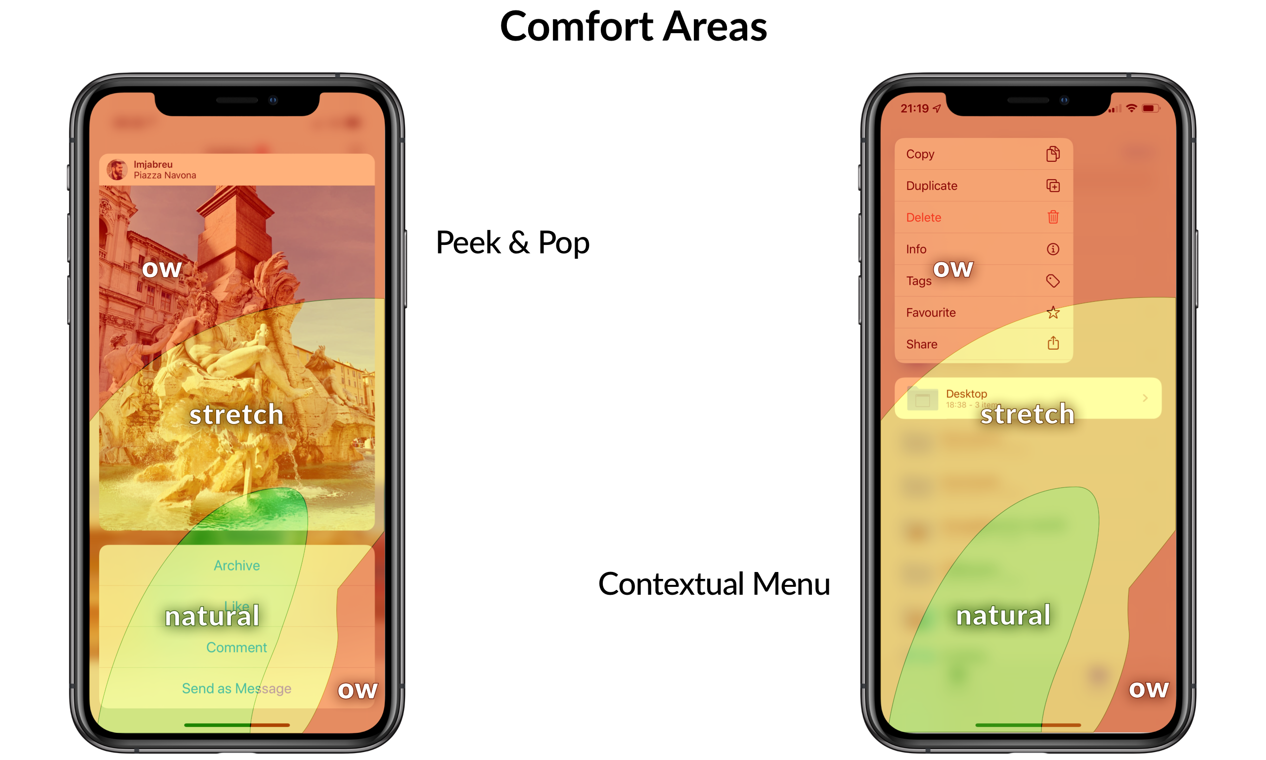
Comfort Areas for Peek & Pop vs Contextual Menu
Ergonomics have degraded. The new actions list no longer spans the whole width of the screen, something contextual actions on iOS have always done (think activity sheets, action sheets AKA share sheets). Full-width buttons can be tapped as comfortably by either left or right-handed people, because they intersect on the comfort areas for both orientations.
However, with Contextual Menus, if the content is on the left half of the screen, the menu will show up on that side, and vice-versa. This means actions don’t always overlap comfort areas, depending on the user’s dexterity or location of the content.
Additionally, the height of each action is way below the comfortable 44pt (or even 56pt) that Apple uses throughout iOS.
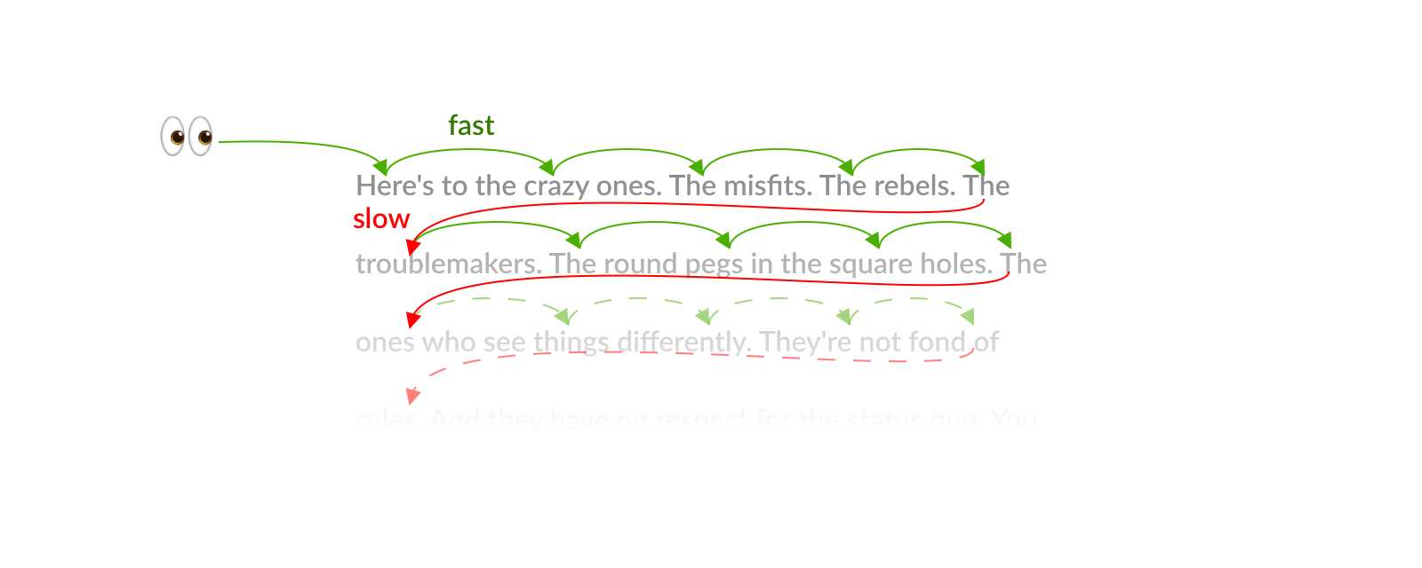
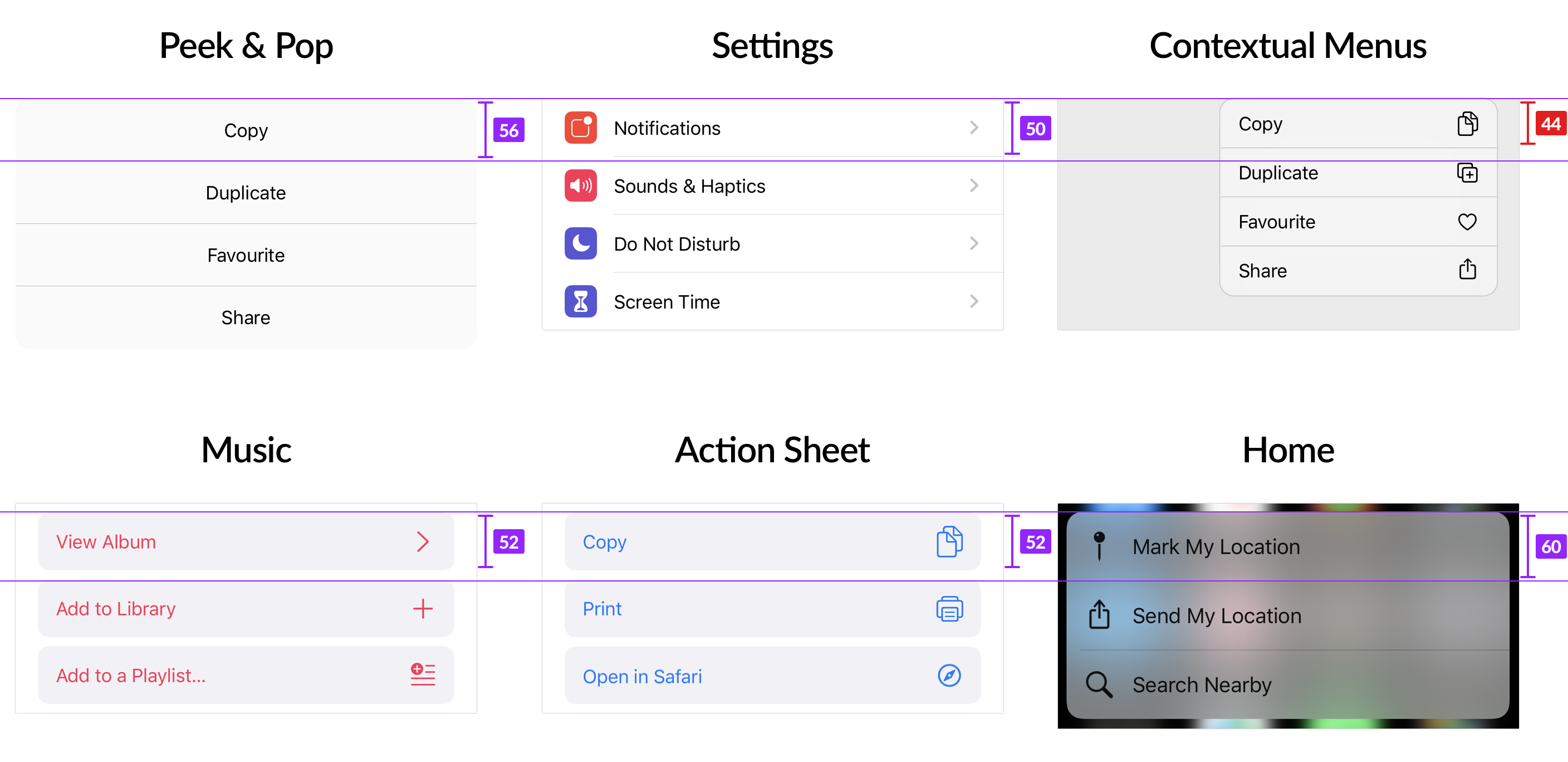
Eye saccades when reading text (short = better)
The final con: reading the actions list is harder.
Our eyes work best if they don’t need to move much when reading content. This is why when you look at the iOS (or Android) Settings app, icons are right next to where the text label starts, so you can quickly jump between them without moving your eyes too much.
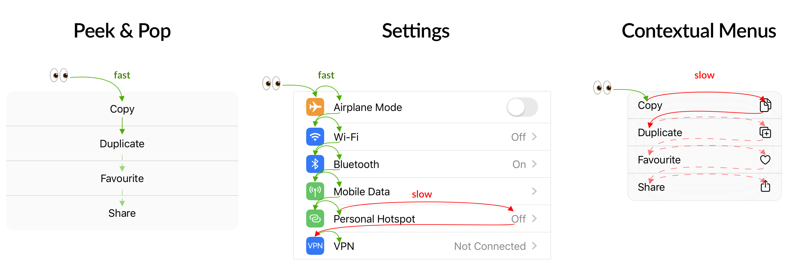
Eye saccades when reading Peek & Pop actions, Settings, and Contextual Menu actions (short = better)
With iOS 13, Contextual Menu actions display their icons on the opposite side of the text label. This means you can’t quickly jump between icons and text labels as you scan the list, without looking at completely opposite edges of the screen. This is also an issue present in the actions list of the new Activity Sheet AKA Share Sheet.
Suggestions
The teams have done a great work with making Contextual Menus available across platforms, and ensuring actions are more easily discoverable, and more capable with the new child-actions, and grouping.
However, let’s see how we could improve the efficiency, ergonomics, and reading speed for Contextual Menus.
Efficiency
On 3D Touch-enabled devices with iOS 13, pressure is currently limited to speeding up the invocation and shortening the long-press gesture.
To improve upon this, Apple could re-introduce:
- Dismissal through finger raise;
- Swipe up actions access;
- “Pop” through increased pressure.
It’s understandable that Apple wants to start getting people used to not having 3D Touch, not only because of future iPhone updates, but also when accessing Contextual Menus across currently-owned devices. I would however recommend for 3D Touch enhancements to be available via Accessibility settings, disabled by default.
It’s important to note that point #2, “Swipe up actions access” would not remove the benefit of increased actions visibility as that comes from the new layout that displays actions alongside the content preview.
Admittedly this would complicate interaction a bit, by requiring users to perform a gesture to fix the actions in place. However the gesture is negligible in terms of effort (cognitive, motor), especially when compared to the new clipboard gestures (undo/redo, cut/copy/paste).
Contextual Menus are an advanced feature that only 20% will use on touch-enabled devices, given that, it’s fine if you have to use animation or other method (layout, icons) of up-skilling users.
Ergonomics
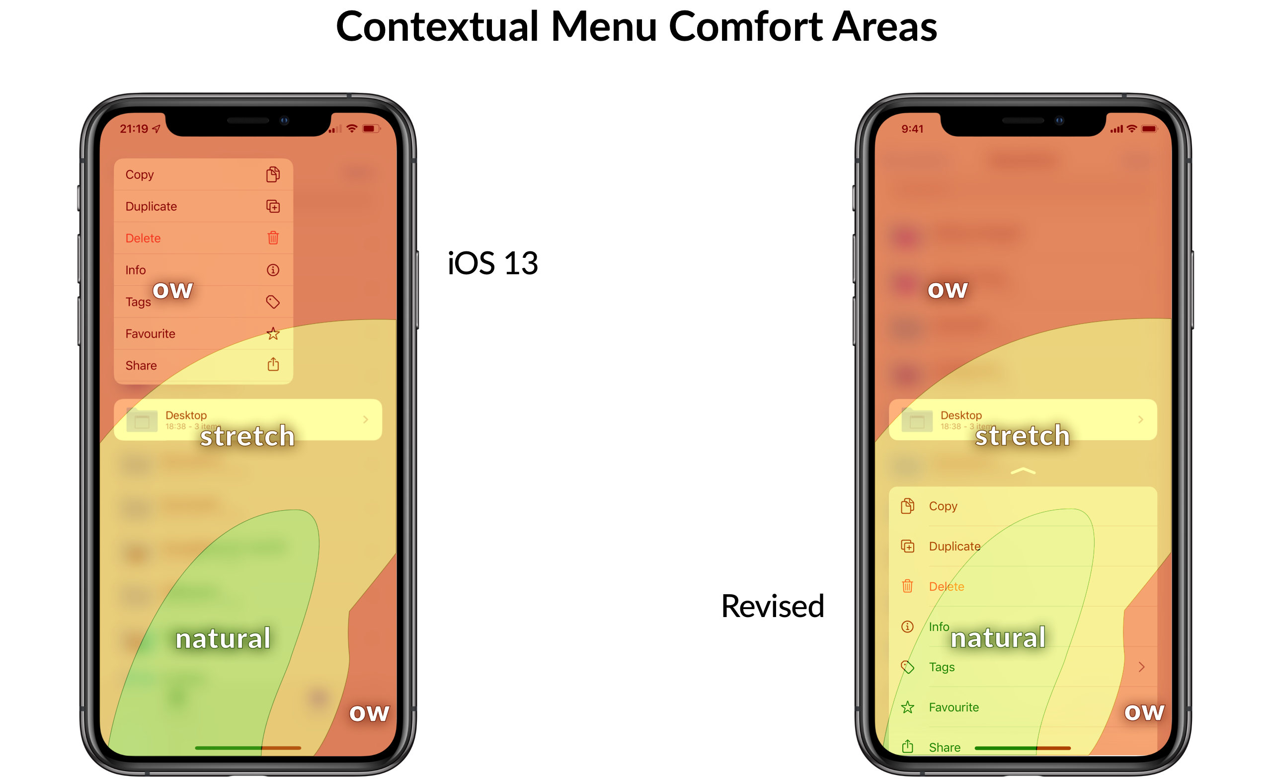
Comfort area comparison between the current iOS 13 and a revised Contextual Menu
Actions in Contextual Menus no longer span across the full screen width.
It is a fact that certain screen areas are easier to tap.
Generally-speaking, the bottom of the screen is easier to tap for everyone, on iPhones of all sizes. If you’re left-handed then the bottom-right will be easier to reach with your thumb, and vice-versa for right-hand users.
Various examples of full-width item lists on iOS
To ensure comfortable use for all users, iOS allows going back by swiping from the bottom edge, and it had until now presented option lists and pickers spanning the full screen width.
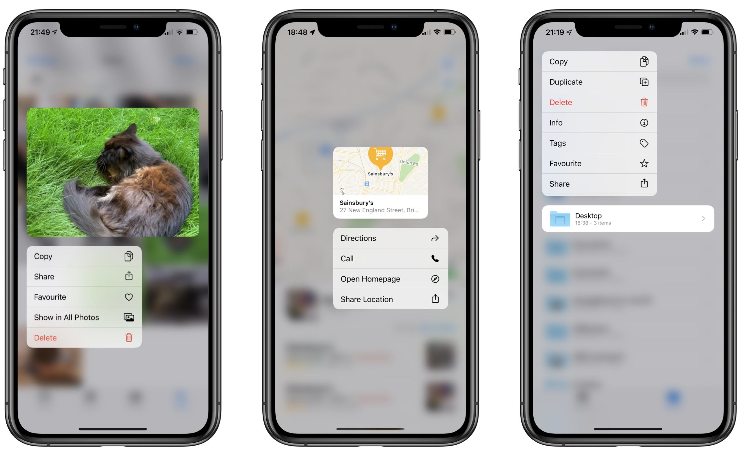
Inconsistent positioning of contextual menu actions: bottom-left, bottom-right, top-left
With Contextual Menus, Actions are presented on the left side of the screen by default, and sometimes on the right side if the tapped content doesn’t span the whole screen width (e.g. a photo on right column of a grid).
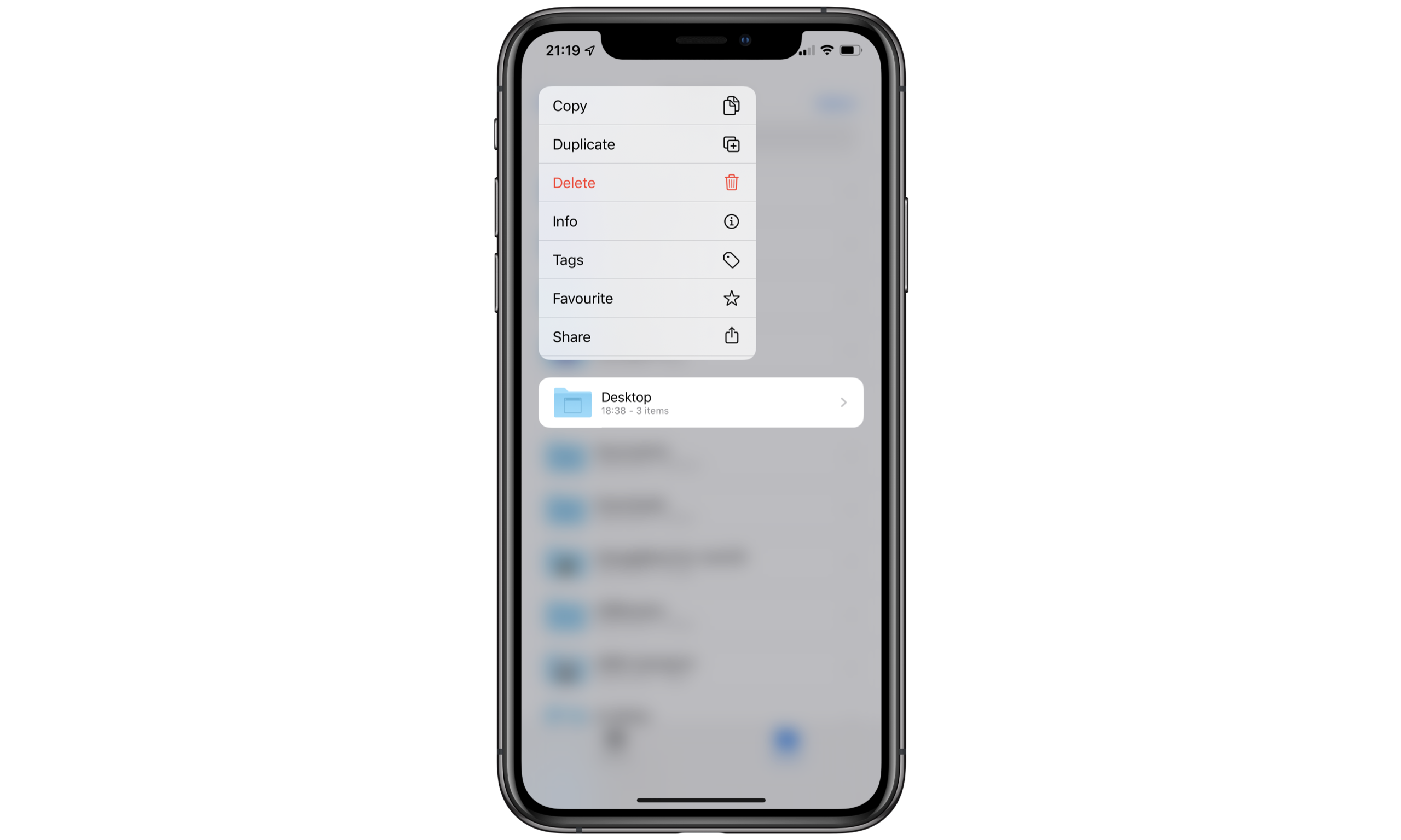
A contextual menu actions list displayed on the hard-to-reach top-left area of the screen.
Sometimes action lists are even displayed on the top area of the screen.
As we’ve seen, this poor and inconsistent positioning means neither left or right-hand users have the most comfortable experience when using with contextual menus.
List item height across Apple’s iOS apps and components
To make things worse, actions hit the minimum recommended height of 44pt, making them harder to tap than most other list items on iOS by comparison.
A revised contextual menu where actions span the full width of the screen and are pinned to the bottom.
To improve the ergonomics of Contextual Menus, actions should be made full-width, taller, and always positioned at the bottom of the screen.
Reading Speed
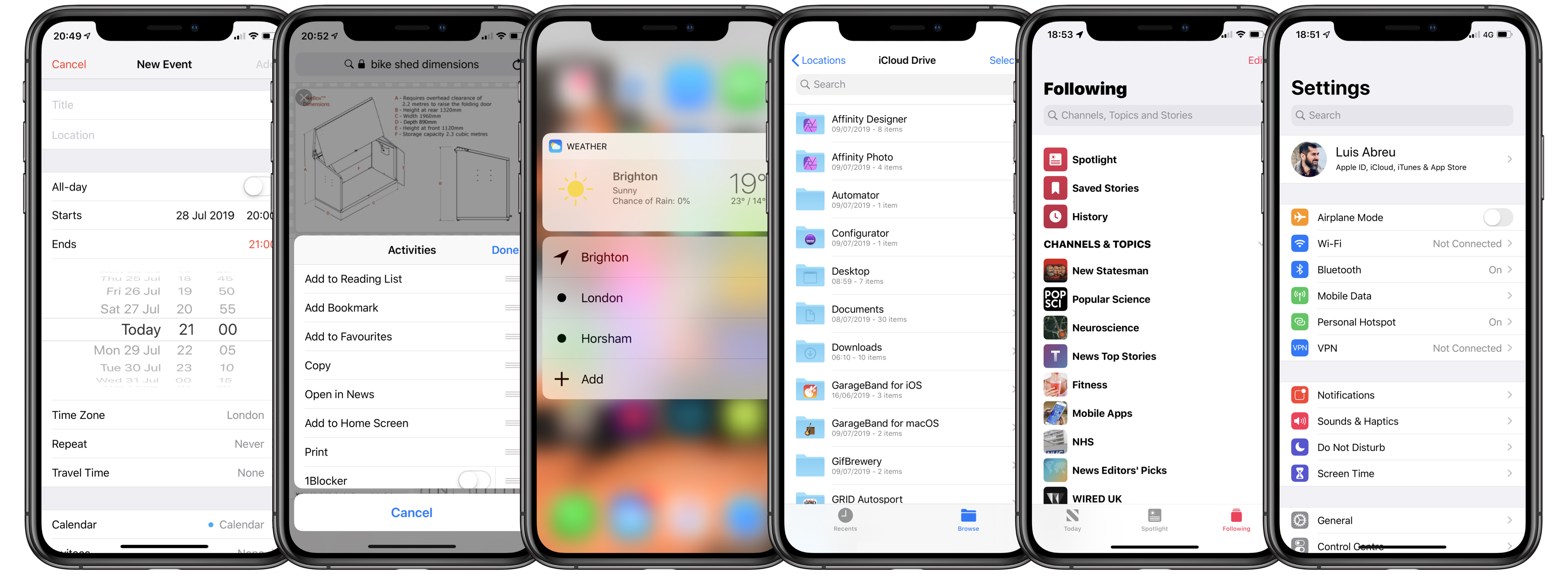
First-party iOS Apps using right-hand icons in list items
This issue impacts not only the Contextual Menu actions list, but also lists in Activity Sheets (more commonly known as Share sheets), and Apple apps like Maps and the iWork suite (Numbers, Keynote, Pages).
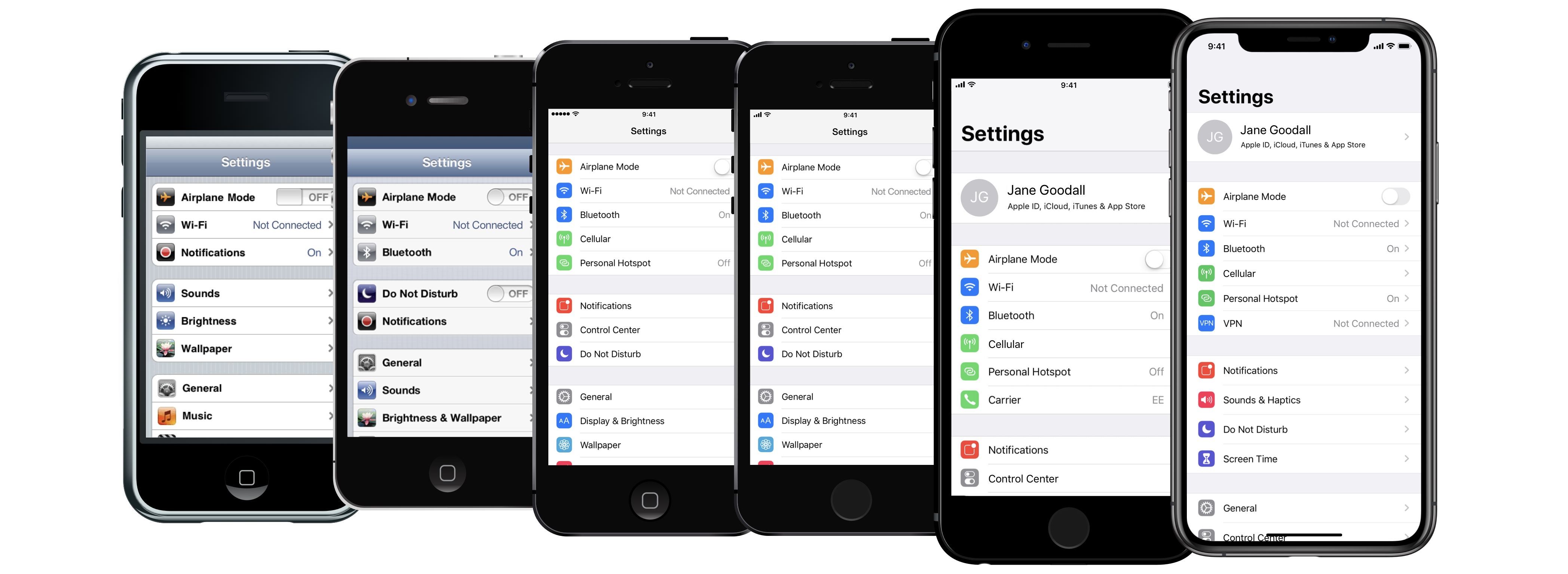
iOS Settings screen over time. Icons never lost their left-hand position.
Ever since the first iOS version, long lists have included rich icons to help users find what there’re looking for faster.
It’s very important to understand that the layout of these icons isn’t arbitrary.
But before we dive into that, we must first understand that you should prioritise the information displayed to the user, as this helps reducing noise and finding information faster. In the Settings screen above, each list item only includes an icon, a text label, and a disclosure icon to hint at the presence of child pages. For commonly changed settings, and to save the user from an additional tap, iOS also displays the current value of a setting either as a text label or switch (e.g. WiFi, Bluetooth, VPN, etc). Notice how both the disclosure icon and setting value are less prominent than the setting name and icon.

Eye saccades when reading lists with left-hand icons (short = better)
As for the layout of icons and labels: because we can process images faster than text, and switching between the processing modes slows us down, each content type occupies its own column. This way, when we scan the icons column, we can remain in image processing mode and are thus more efficient at finding what we’re looking for.
When the icon isn’t enough, we switch to the slower text processing mode and confirm by reading the action’s name in its text label.
When the text label is positioned next to the icon, our eyes only have to move a tiny distance to switch between them.
These eye movements are called Saccades. When you read, your eyes perform at least 3 saccades per second, moving at 9 mph, and ideally lasting 20ms or so.
To prevent disorientation from motion blur, your brain blocks out your vision until your eyes have stopped. Saccades happen without you ever noticing, and without distracting you from what you’re reading.
The problem with the new Contextual Menu actions is that text label and icons are too far apart, so reading them both takes longer.
The simplest way to solve this would be to place the icons next to the text label.
Summary
We’ve seen how Contextual Menus are a consistent (but not the only) way for performing actions on specific on-screen items. Adapting gracefully to touch (iOS) and pointer-based platforms (macOS).
We’ve also seen how some design decisions have made Contextual Menus perform worse for time-sensitive advanced users on iOS, than Peek & Pop.
Issues can be summarised to:
- Efficiency
- Ergonomics
- Reading Speed
And how to solve them, Contextual Menus should:
- Improve 3D Touch usage and gestures
- Offer full-width, bottom actions
- Place icons next to labels
I’m curious to see if the teams at Apple make some improvements to both Contextual Menus and Activity Sheets who both suffer from the reading speed problem.
Hope you’ve enjoyed and ping me on Twitter if you’ve got any thoughts on this.
[UPDATE] 15 August 2019: Apple has improved Contextual Menus activation and detail actions so they’re as fast as 3D Touch (on eligible devices). Dismissal action is also significantly faster.
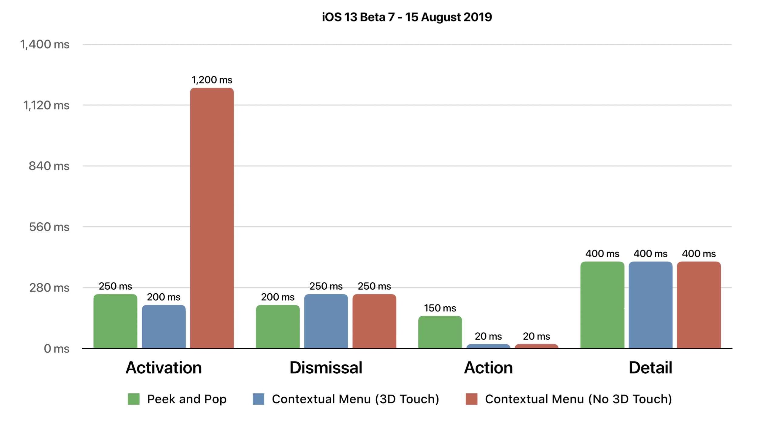
Timings for Peek & Pop vs Contextual Menu, 15 August 2019