A world map showing the countries where AmRest operates: Austria, Bulgaria, China, Croatia, Czech Republic, France, Hungary, Poland, Portugal, Romania, Russia, Serbia, Slovakia, Slovenia, and Spain
In Poland, AmRest runs the KFC franchise with an expanding network of 280 restaurants. This franchise operator is active in 10 other countries, and holds the franchise rights to Starbucks, Burger King, Pizza Hut, KFC, and more.
This case study is about the KFC Poland mobile app and its Order & Pickup feature. I’ve also written about how I helped create a best-in-class in-restaurant Kiosk currently deployed to over 300 restaurants across 3 countries.
Goals
- Introduce Order & Pickup on iOS and Android
- Improve the mobile app experience
- Increase number of logged in users
In 2016 only Starbucks US had Order & Pickup, direct KFC competitors like McDonalds had no matching solution.
Order & Pickup benefits:
- Avoid waiting in queues by ordering ahead
- Stress-free ordering without holding up other customers
- Remove language barrier for tourists and staff
Role
Agency-side Lead Designer, responsible for end-to-end design of the mobile app, as well as liaising with client and various suppliers.
End-to-end design included: research (formal/guerrilla/market), design sprints, interactions, visuals, content, prototypes, strategy/prioritisation, documentation, and developer guidance.
Process
Initial Engagement
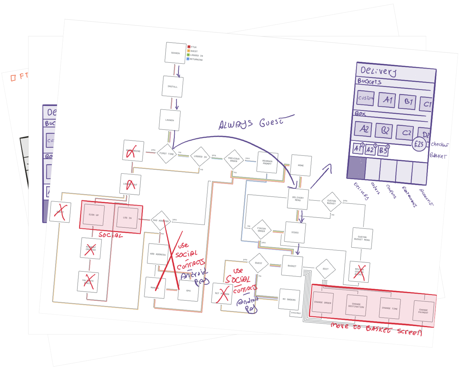
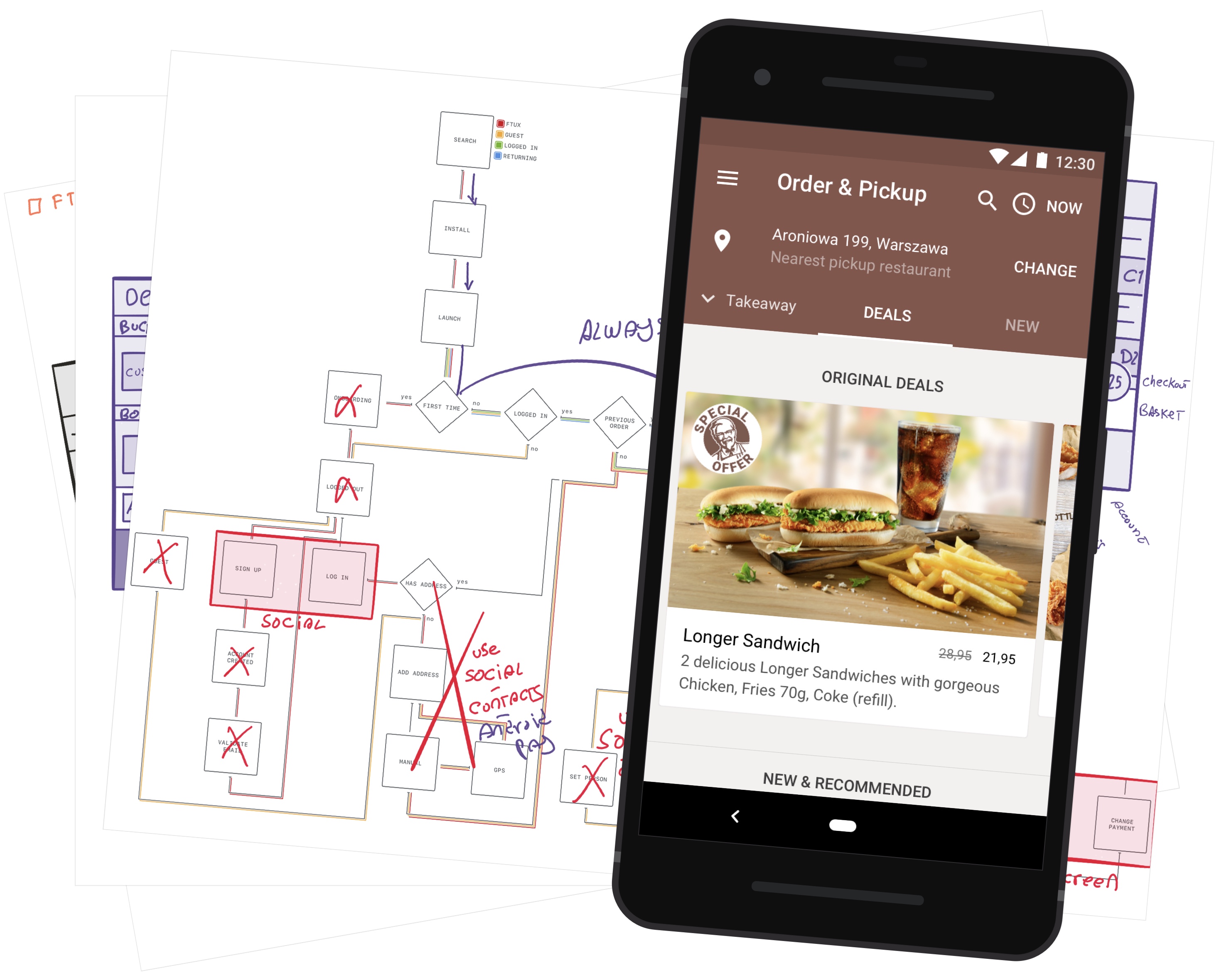
From the Heuristic Analysis, the core journey user flow, annotated with improvements.
The initial engagement was a heuristic analysis of the existing mobile app, guided by AmRest/KFC’s goals and backed by behavioural economics and other research.
The issues and improvements were presented to key client stakeholders (MD, COO).
Kickoff Design Sprints

The Design Sprint room
The actual project kickoff started with two back-to-back week-long Design Sprints, on-site in Wrocław, Poland.
Design Sprints leverage collective intelligence, include the client in the design process, and establish a mutual understanding of values, design, and goals.
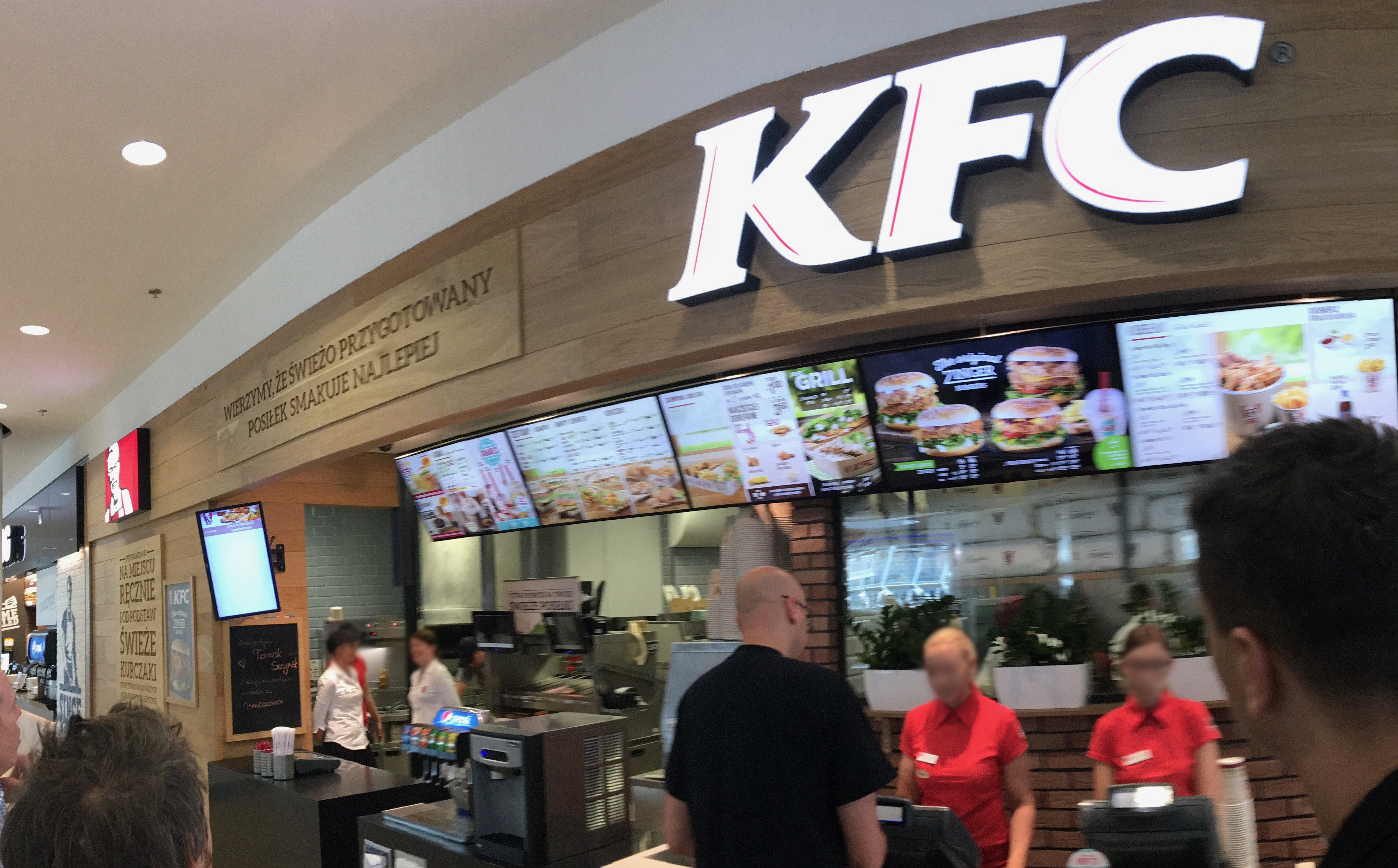
A KFC restaurant in Wroclaw, Poland
In these Design Sprints, we learned about restaurants and staff from Operations, and by visiting them; Product vision and local consumer insights from Founders; and the company’s digital journey and performance from Digital.
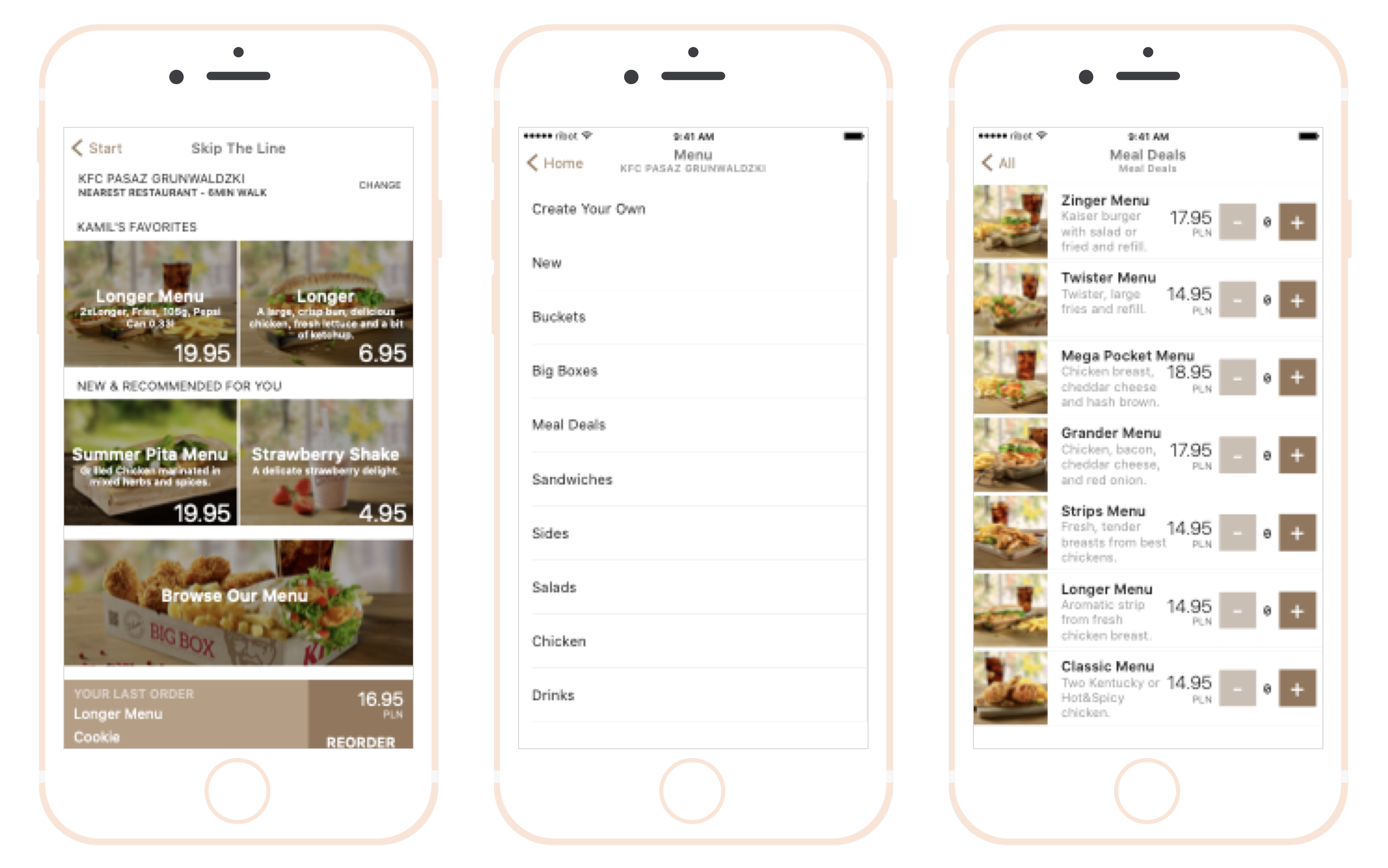
Sample rough prototype screens from the first Design Sprint
In a single week, we mapped the ideal Order & Pickup journey, discussed assumptions and challenges, focused on the biggest challenge, ideated together, and validated prototypes with customers.
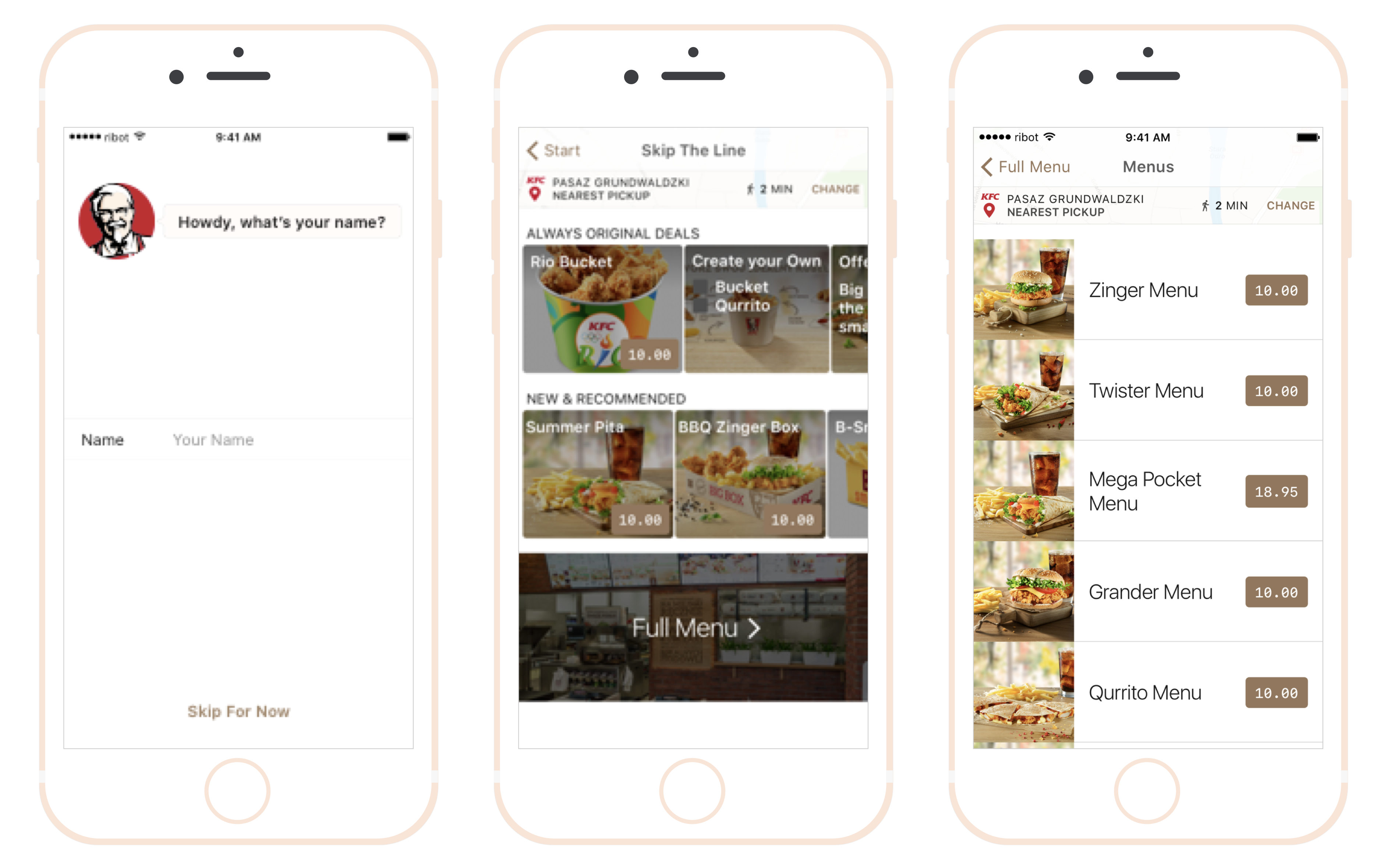
Sample rough prototype screens from the second Design Sprint
In the second Design Sprint we looked at what we learned, iterated our prototype, and validated with users once more.
Production
Back in the UK and further from blue-sky thinking, armed with the Design Sprint learnings, we started the production phase.
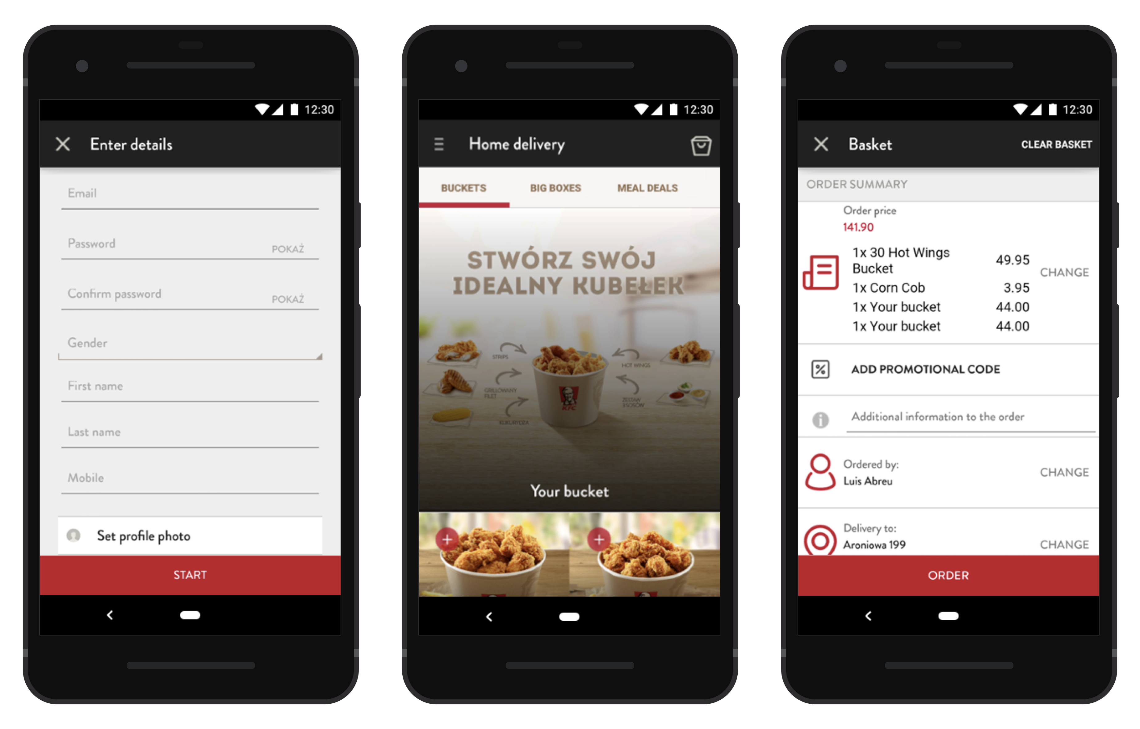
The app before our work began
Before Order & Pickup could be introduced to the public, we needed to iterate not just the app, but also backend, restaurant operations and hardware.
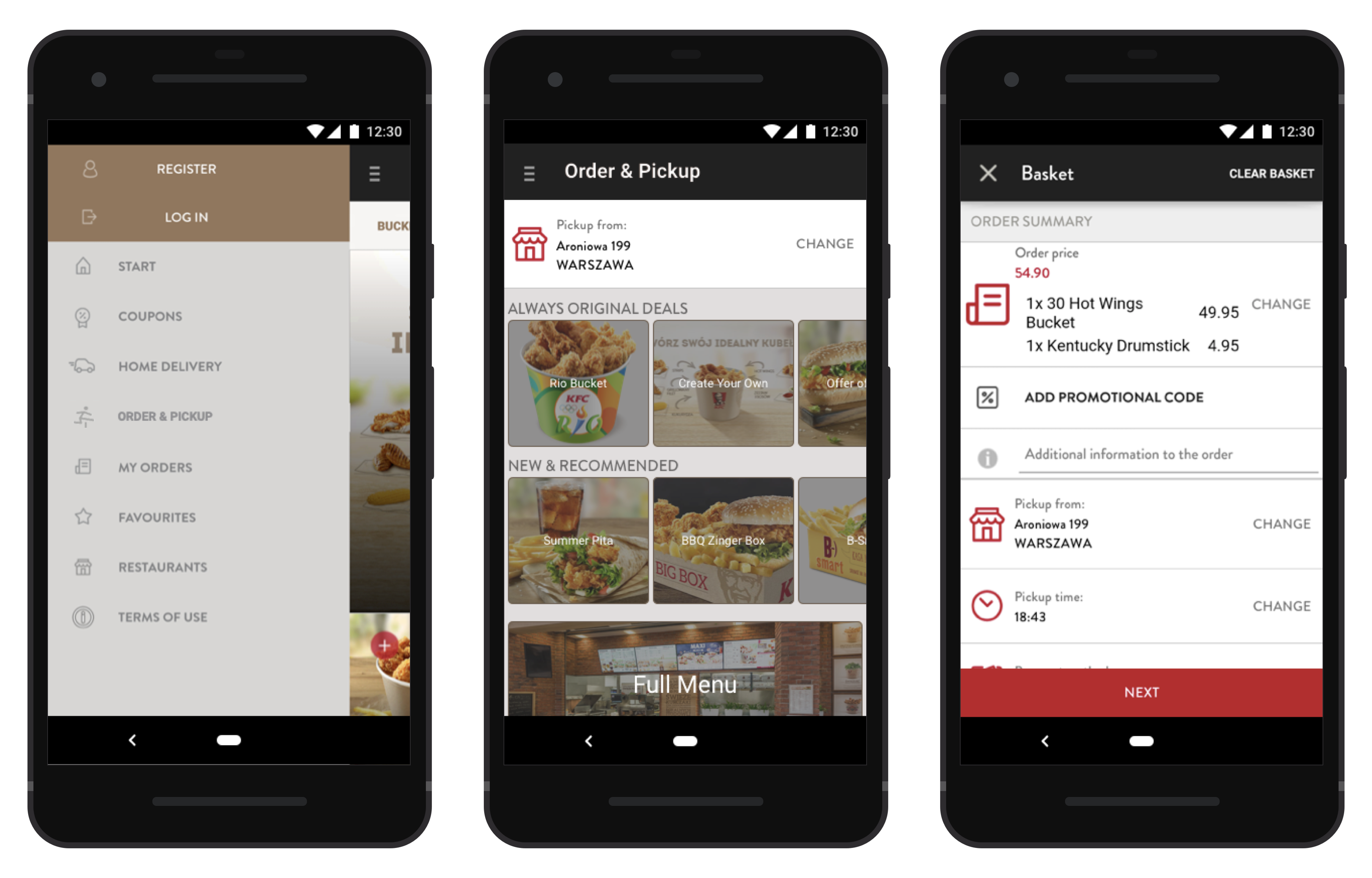
The MVP was introducing Order & Pickup using existing visual components
To support the development of backend, prepare restaurants, and tweak the overall experience, we created an internal MVP release where Order & Pickup was crudely added into the existing app (seen above).
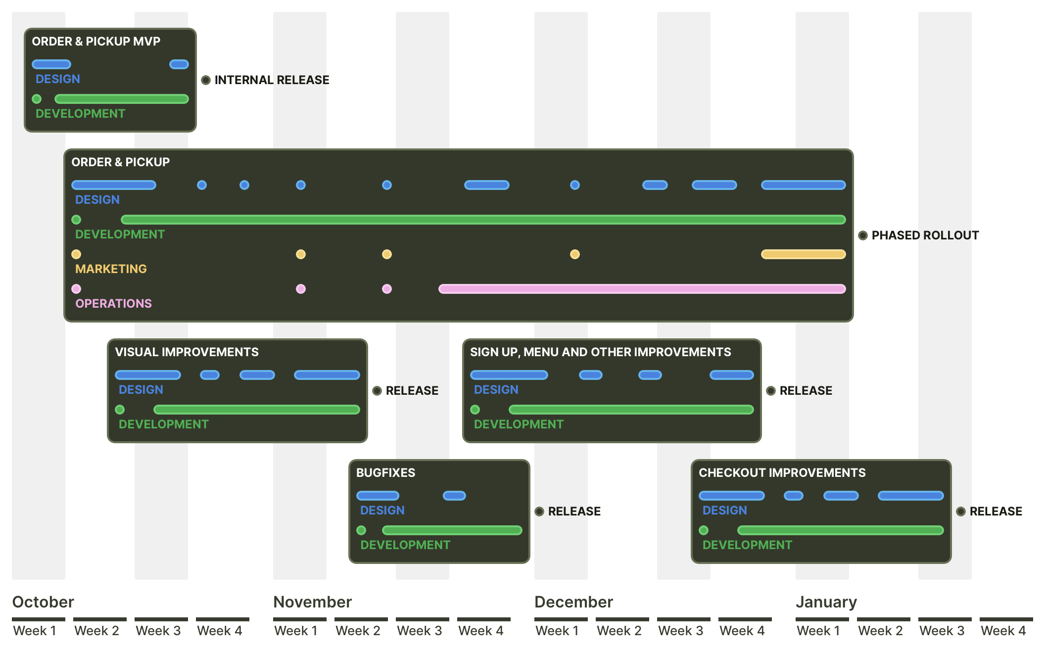
An illustration of our iterative process
In parallel with Order & Pickup, we worked on and released small blocks of work. These were aligned with the previously mentioned goals around improving customer experience and conversion metrics.
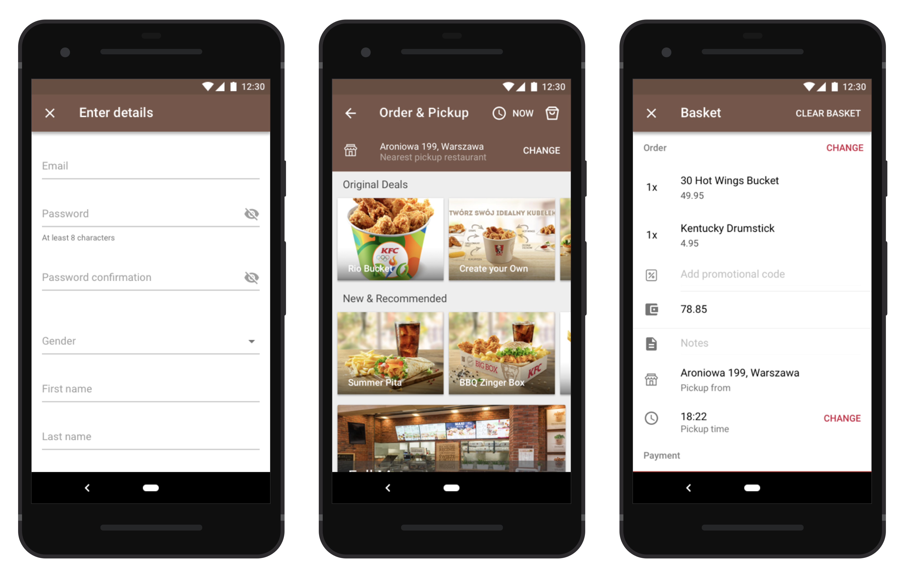
Purely visual improvements, excluding interaction or copy
We brought the app more in line with the Polish KFC brand (see previous restaurant photo) and fixed a few visual inconsistencies. As per the Aesthetic-Usability Effect this made app ratings and engagement more resilient against bugs and issues.
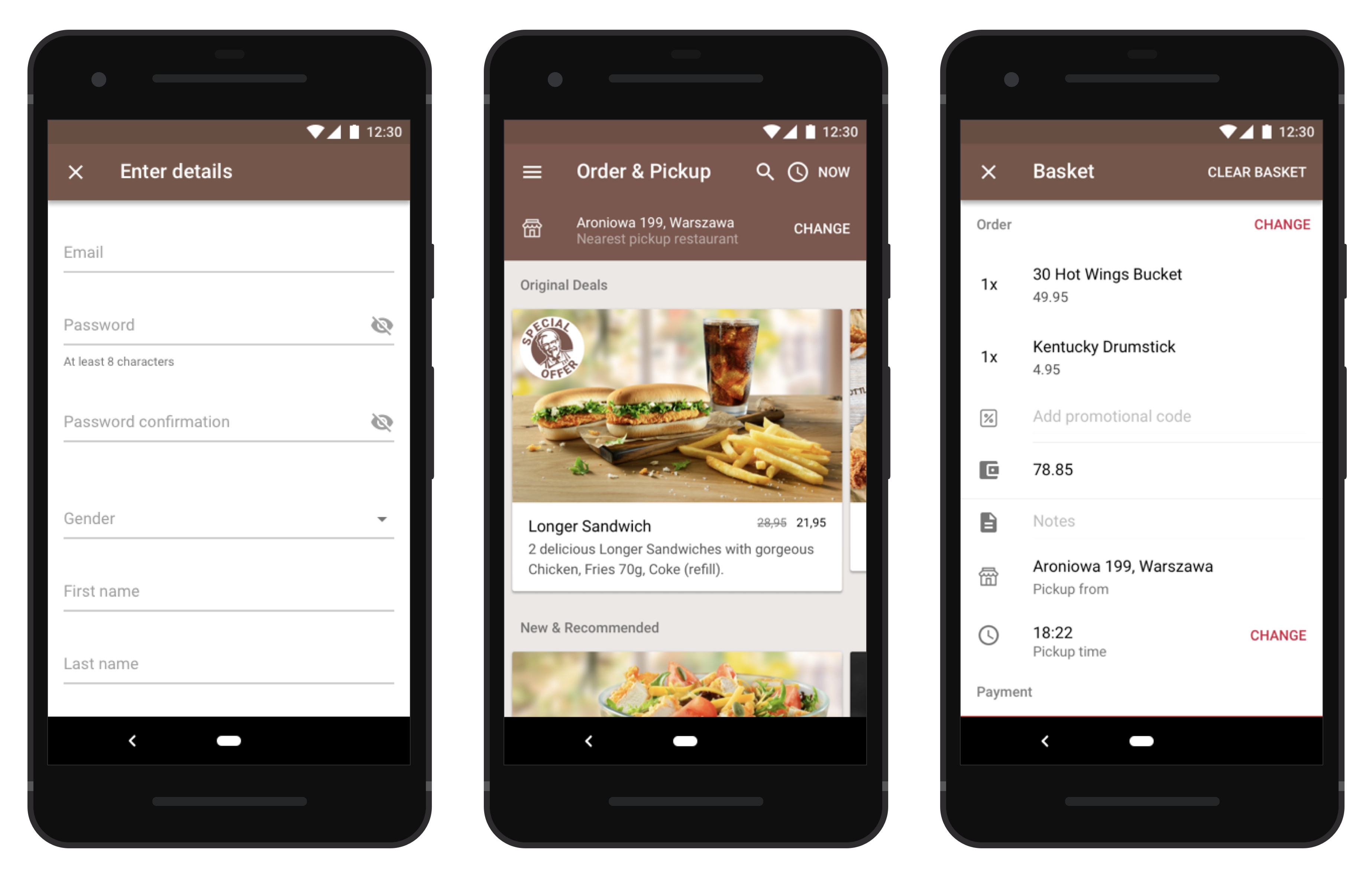
Improved Menu: more readable and easier to browse
The food menu was changed based on Design Sprint and research:
- Replaced hierarchical with inline categories;
- Sorted categories alphabetically;
- Improved text contrast;
- Displayed product details and pricing inline;
- Emphasised product images and promotions.
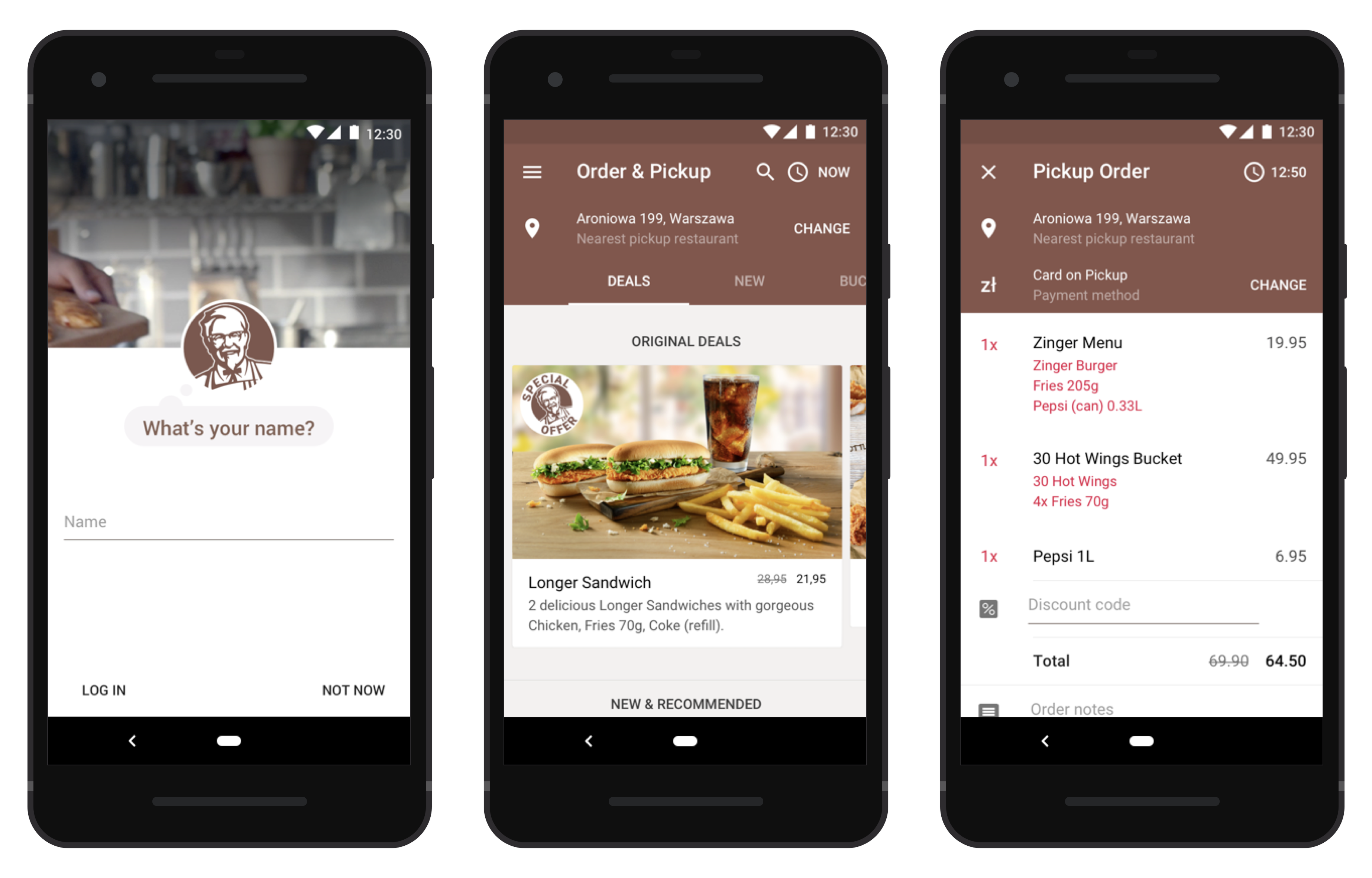
Further improvements to Onboarding, Menu, Checkout, and many other areas such as Account and Order History
We further improved Onboarding, Menu, Checkout, and many other areas such as Account and Order History:
- Gradual Profile Creation: collect small bits of data, when it adds value to the user;
- Personalisation: use existing data to personalise the experience;
- Emotion: use the powerful Colonel branding to bring fun to the app;
- Menu: add tabs as an alternative to vertical scrolling;
- Checkout: prioritise information and simplify editing.
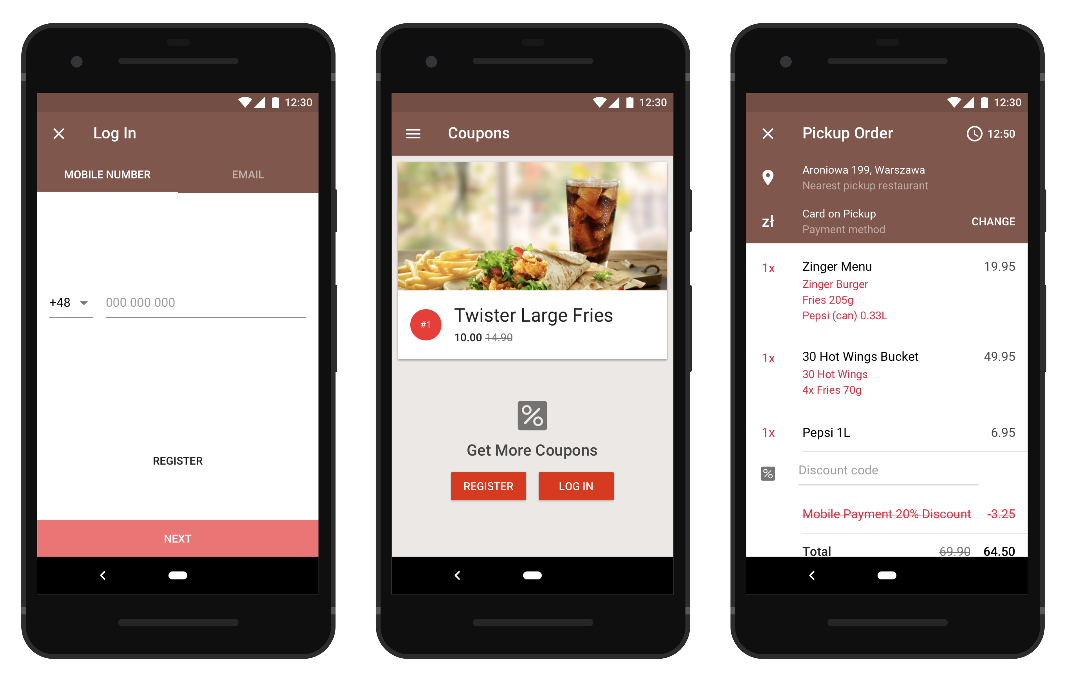
Introduced Order & Pickup, phone number authentication, incentives for mobile payment and becoming a registered user.
Restaurant operations are highly optimised processes, with specific roles and procedures to ensure food delivery is fast and consistent.
Order & Pickup was tested internally for months, and slowly rolled out to all 200+ restaurants, one at a time.
The public release of Order & Pickup had this feature turned on for all users, users were notified as the feature became available to them based on their location.
In addition to Order & Pickup, this release included:
- An authentication process that took only seconds;
- Mobile payment incentives to simplify restaurant operations;
- Incentives for logging in by offering additional coupons;
- Standardised order customisations: buttons for No-Onion and other requests instead of error and deviation-friendly text inputs.
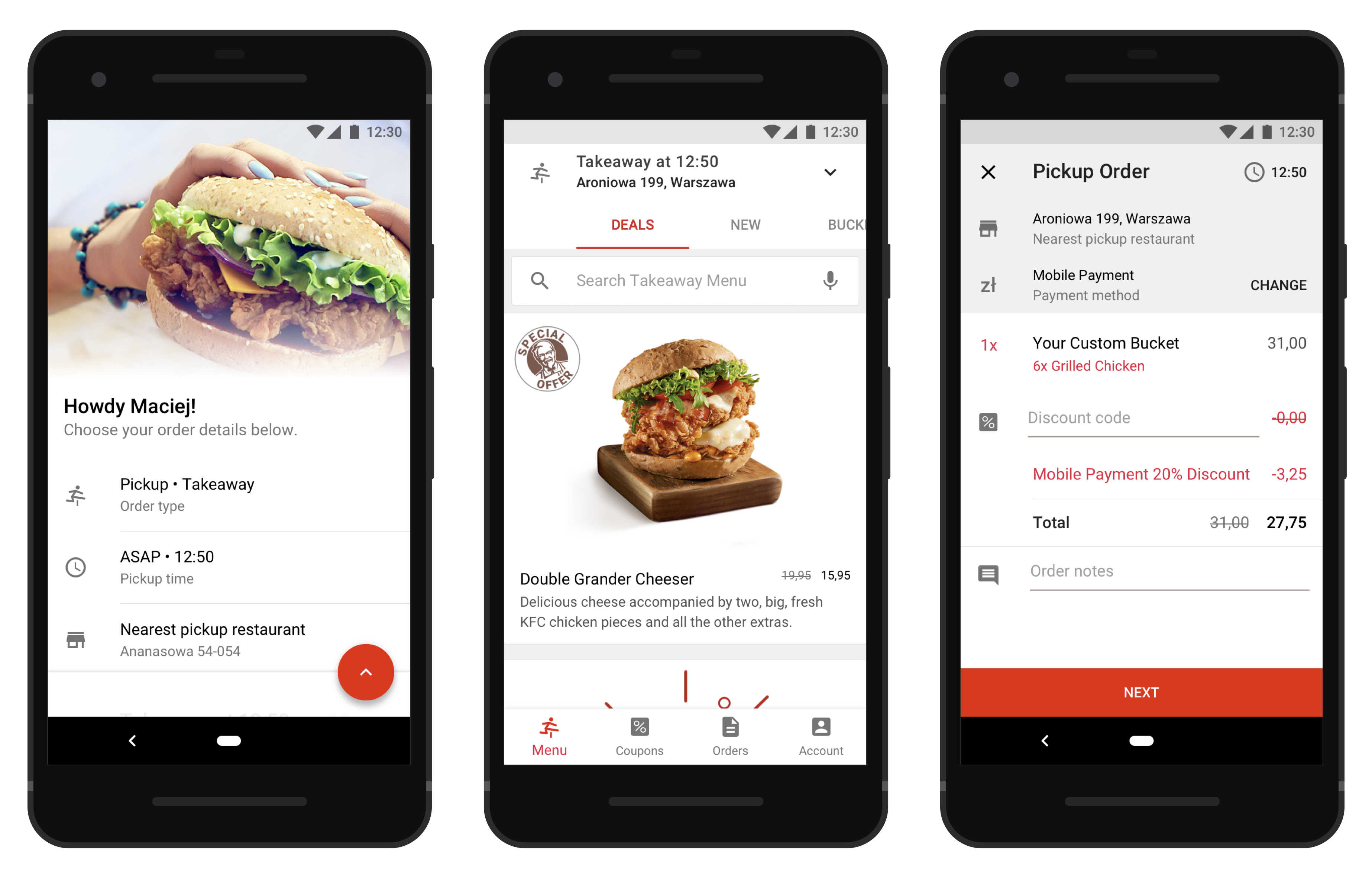
A future release unifying branding with KFC Global, simplified ordering and product imagery to increase conversion
Outside the main work streams, we looked at the long-term vision for the app. We:
- Reviewed product photography to increase conversion, backed by research and business insights
- Prioritised Search versus manual browsing, catering for previous searches, undecided users, typos, and no results.
- Improved email communication templates
- Created product-specific background videos for use in Order Status screens
- Replaced sidebar with tab bar navigation
- Introduced card scanning to increase first-time user checkout conversion
- Inline product preference surveys for personalised menus
- Fun Create Your Bucket, rich with visual effects and animations
- Improved re-ordering flow catering for replacement of stock variance over time and between restaurants
This version wasn’t intended for immediate release but to re-focus on the long-term overall vision of what’s best for customer and business.
Results
The app increased orders per day per restaurant 20% week-over-week.
Over 2 months, across iOS and Android, 4-star ratings increased by 8%, and 5-star ratings increased by 15%.
As a result of this collaboration, we then worked on KFC’s In-Store Kiosk.
The Polish KFC mobile app is live, and iterated since my involvement, current ratings average 4 stars across iOS and Android.
Update 2020/04/09: 3 years after its deployment, the app has been rolled out to additional countries: Czech Republic, and Hungary.
Learnings
1. Design Sprints are fantastic
Design Sprints are a fantastic tool to kickstart projects. They help you quickly uncover false assumptions, gain a good understanding of the whole business and its users. This and other projects helped me become comfortable running Design Sprints with little planning and in as little as 1 day.
2. Assumptions are your worst enemy
Both senior stakeholders and ourselves came to this project with assumptions about how users behave. We learned through user research how incorrect those assumptions were, and how many unknown unknowns were still left to discover.
We experienced first-hand how poorly hierarchical menus perform compared to text search.
We also discovered how attitudes differ between the UK and Poland:
- Card scanning made popular by Uber and Card.io (now part of Braintree), wasn’t trusted by Polish users, citing security concerns. We decided to roll it out anyway and educate users for the greater good.
- Peak hours are vastly different between UK and Polish KFC users
- Coupons and quantity discounts are key conversion factors for this user segment
3. Suppliers are not a commodity
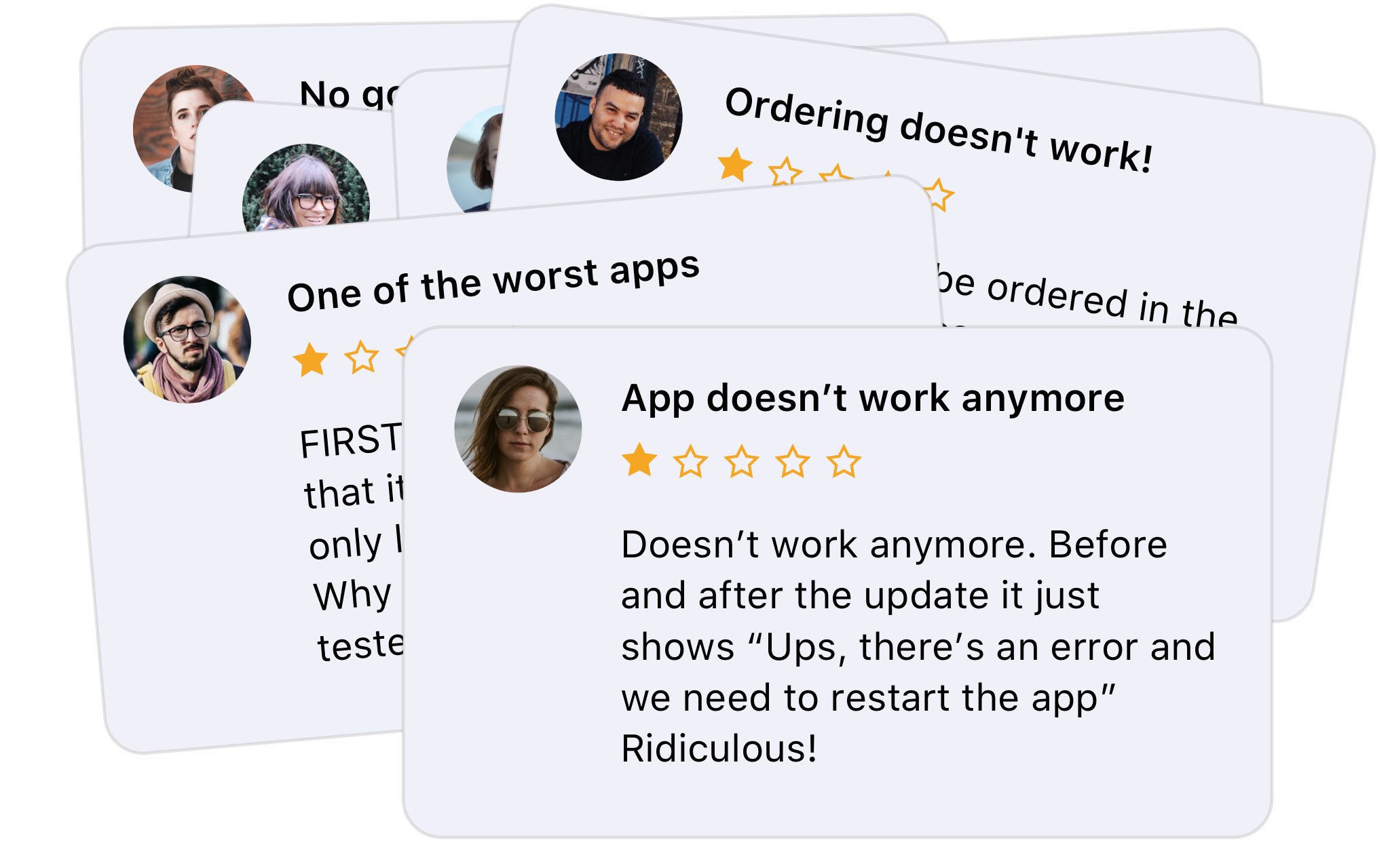
Negative reviews due to poor backend and app reliability
The success of your app requires everyone to be in tip-top shape. Payment providers can make-or-break your checkout experience, development houses can slow down your release cycle and invalidate your design investment.
Quality software results from investing in quality product design and development.
4. App Analytics are essential
We didn’t spend enough time on App Analytics. As a result we had to rely on coarse Business Insights to measure success. We corrected this in the following KFC Kiosk project.
5. Internal stakeholders are a gold mine
Research inwards as well as outwards. Internal stakeholders are a gold mine, they’re able to seed your research with insights ranging from product pricing to details about restaurant operations.

