Context
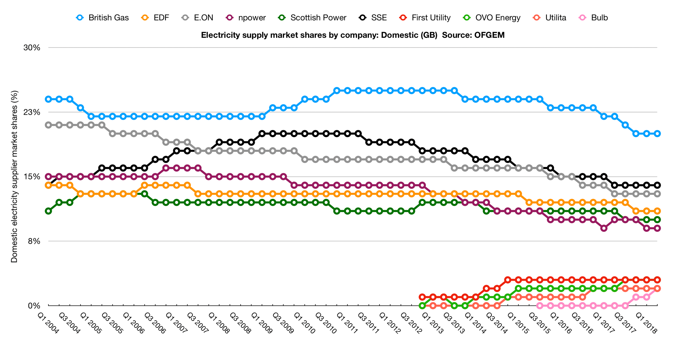
As of 2018, in the UK, there are 6 energy providers who serve 80% of the market. The remaining 20% market share is served by 70 smaller energy providers.
While 80% might sound like a comfortable market share, customers are switching away from the Big 6 faster than ever. One of the Big 6 lost as many as 1 million customers in a 5 year period, representing a 5% drop in market share.
Faced with a rapidly diminishing market share and new customer acquisition, the Big 6 are left with no choice but to improve customer experience.
Finally, by 2020, all UK energy providers must allow customers to own a smart meter if they wish to.
Smart meters allow customers to check their energy usage and costs in real-time, opposed to having to decipher complex bills every 30 days.
Problem
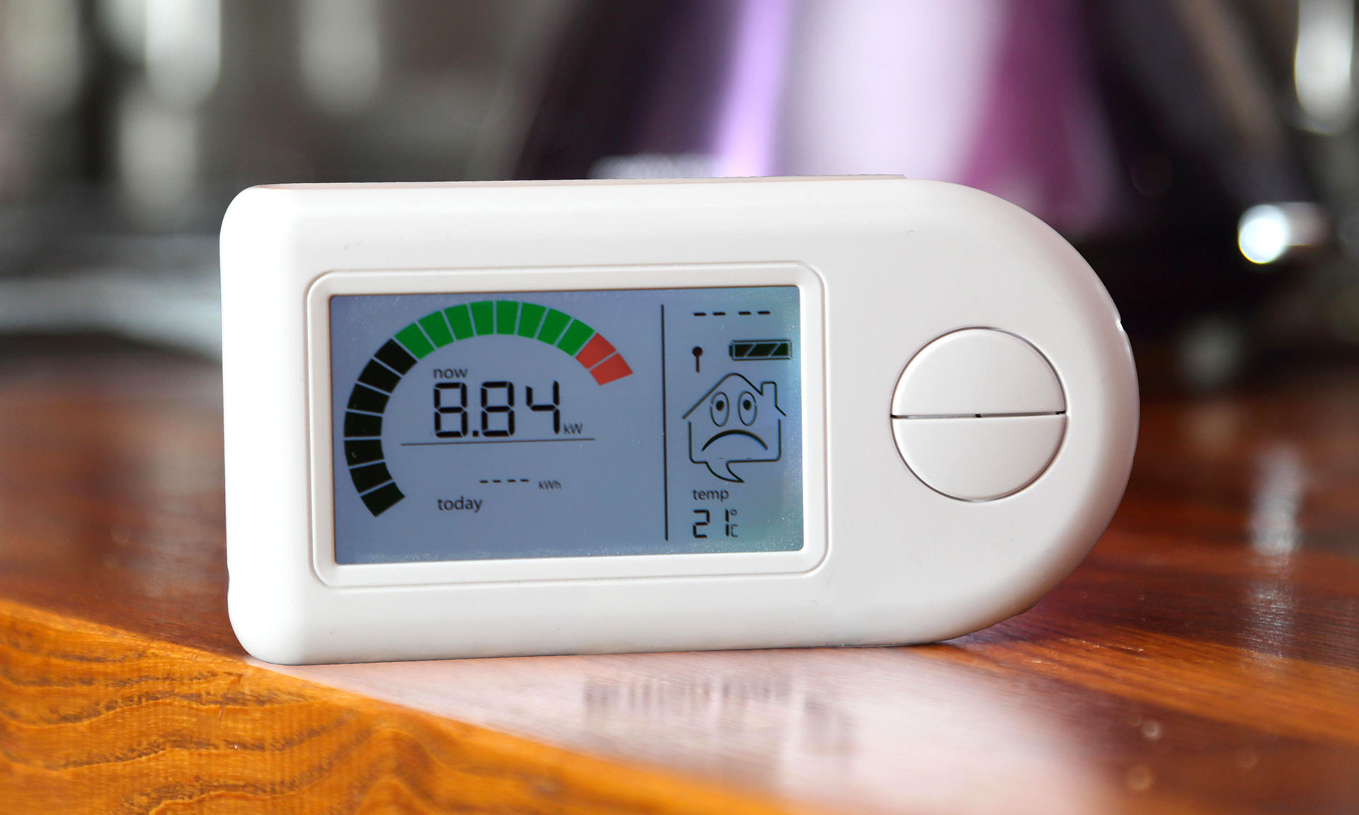
The problem is that smart meters alone don't lead to significant positive outcomes for customer or business.
For customers, automatic energy usage readings may be convenient, but smart meter displays show only technical and factual data that offers little help at reducing costs.
For energy providers, a smart meter rollout to millions of customers brings logistical headaches but no market differentiation.
Solution
The solution I worked on was a service that would provide customers with actionable energy usage insights, for both current and historical data, accessed via a website or app.
The product was intended to be released to 1000 customers, in order to get early feedback and iterate before the final release.
Role
This project was conducted in 2016, when I was Sr. UX Designer at an award-winning, boutique design agency called ribot.
My team included senior client stakeholders, as well as other agency colleagues. From the client's innovation lab we had product owner, product manager, and infrastructure team, from the agency we had one other Sr. designer, front and back-end developers, as well as project manager.
I participated in Google Design Sprints involving both client and agency, sketched, wireframed, mocked up, prototyped, created a quantitative measuring plan, and collaborated very closely with agency and client developers.
Process
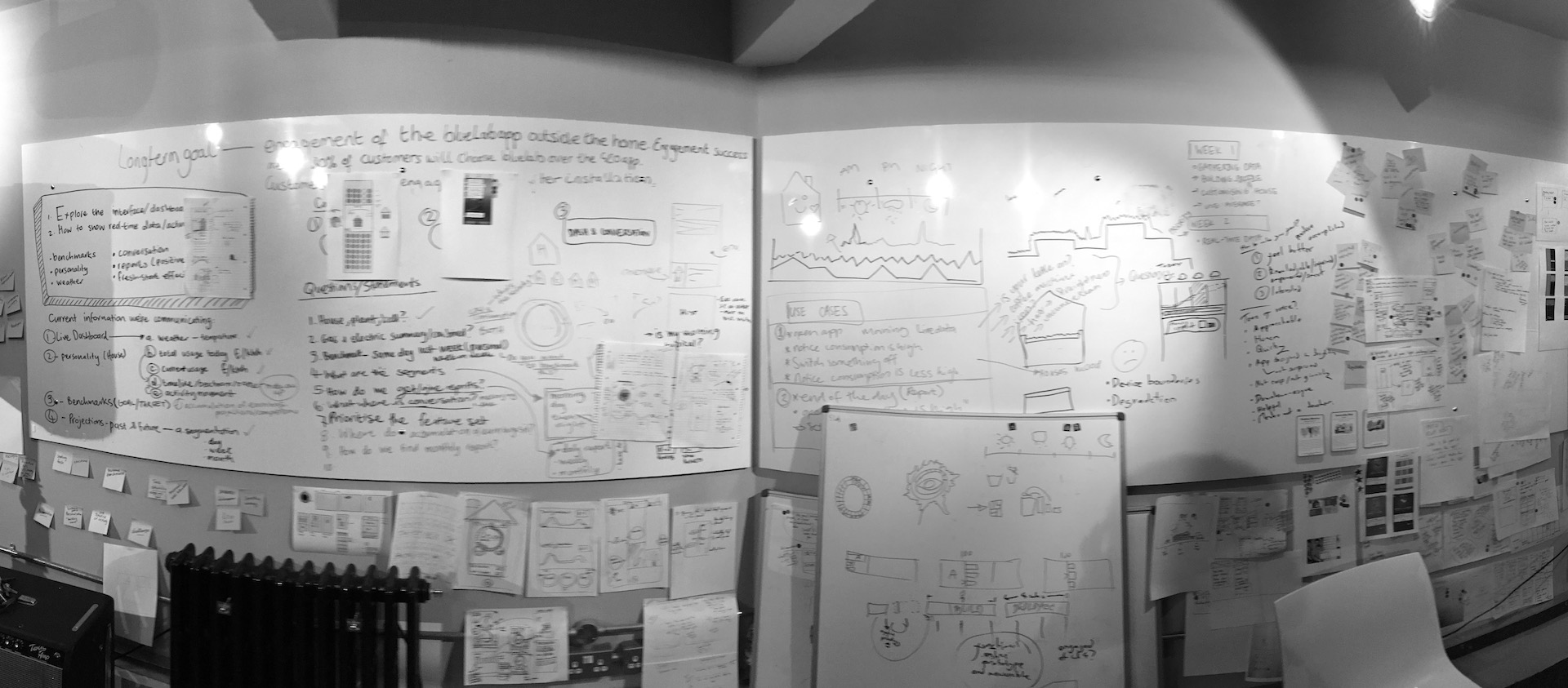
All projects start with alignment between parties, and a Google Design Sprint is the best way to achieve this.
A Google Design Sprint is a highly collaborative 5-day process that starts with discovery and ends with the validation of a small prototype against real customers.
So at the beginning of this project, we used a Google Design Sprint to align our goals and KPIs with senior client stakeholders. We then mapped out the whole flow of the smart meter experience, from multiple actors: client, installer, and end-customer. Next, we agreed to focus on just one actor, one section of the flow, and listed the biggest threats to that focus area. Multiple Design Sprints would be required to iterate this focus area or move onto the next one, with production-level detail added outside a Design Sprint.
After the initial Design Sprint, with a good understanding and starting point for the main area of the end-customer product, we proceeded to iterate and validate further work with client and end-customers. Quickly we ended up with mockups for the main areas of the app (History, Home, Insights, more), static and hi-fidelity motion prototypes to help with handover and tested with end-customers, and in parallel an implementation of the app that worked with real smart meter data.
Last but not the least, I worked closely with the developers to implement an appropriate quantitative measuring plan that would answer the key questions and KPIs defined in the initial Design Sprint.
Results
Due to an internal client reorganisation the rollout was never concluded, neither were our ideas of how to integrate the service with Chatbots (Facebook Messenger) or Wearables (Apple Watch).
Despite the lack of a rollout, we produced a working application, measuring plan and implementation, and future vision for providing access to the service from Facebook Messenger and the Apple Watch.
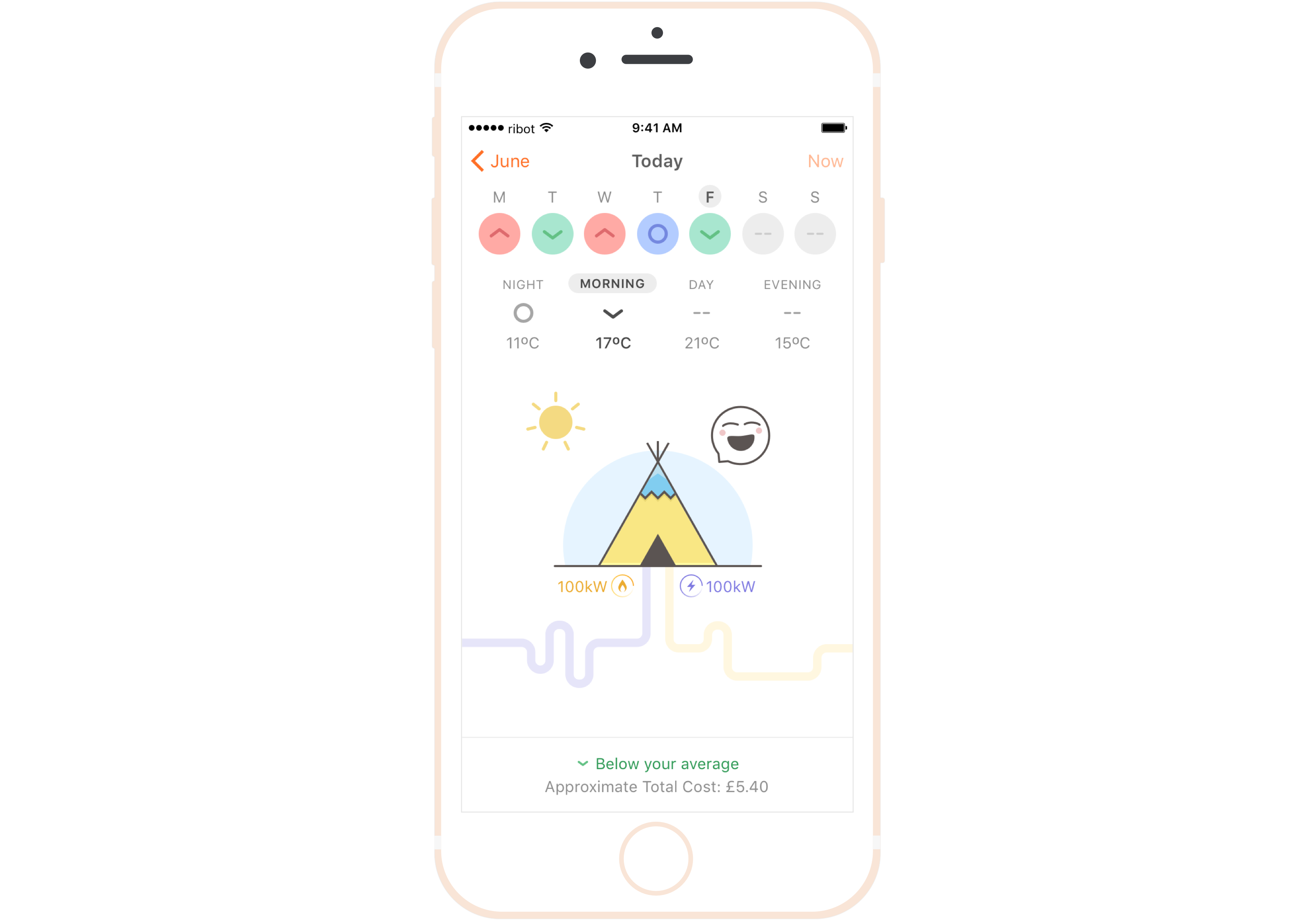
The app allowed for customer log in, provided real-time and historical benchmarking, and personalised energy-saving tips.
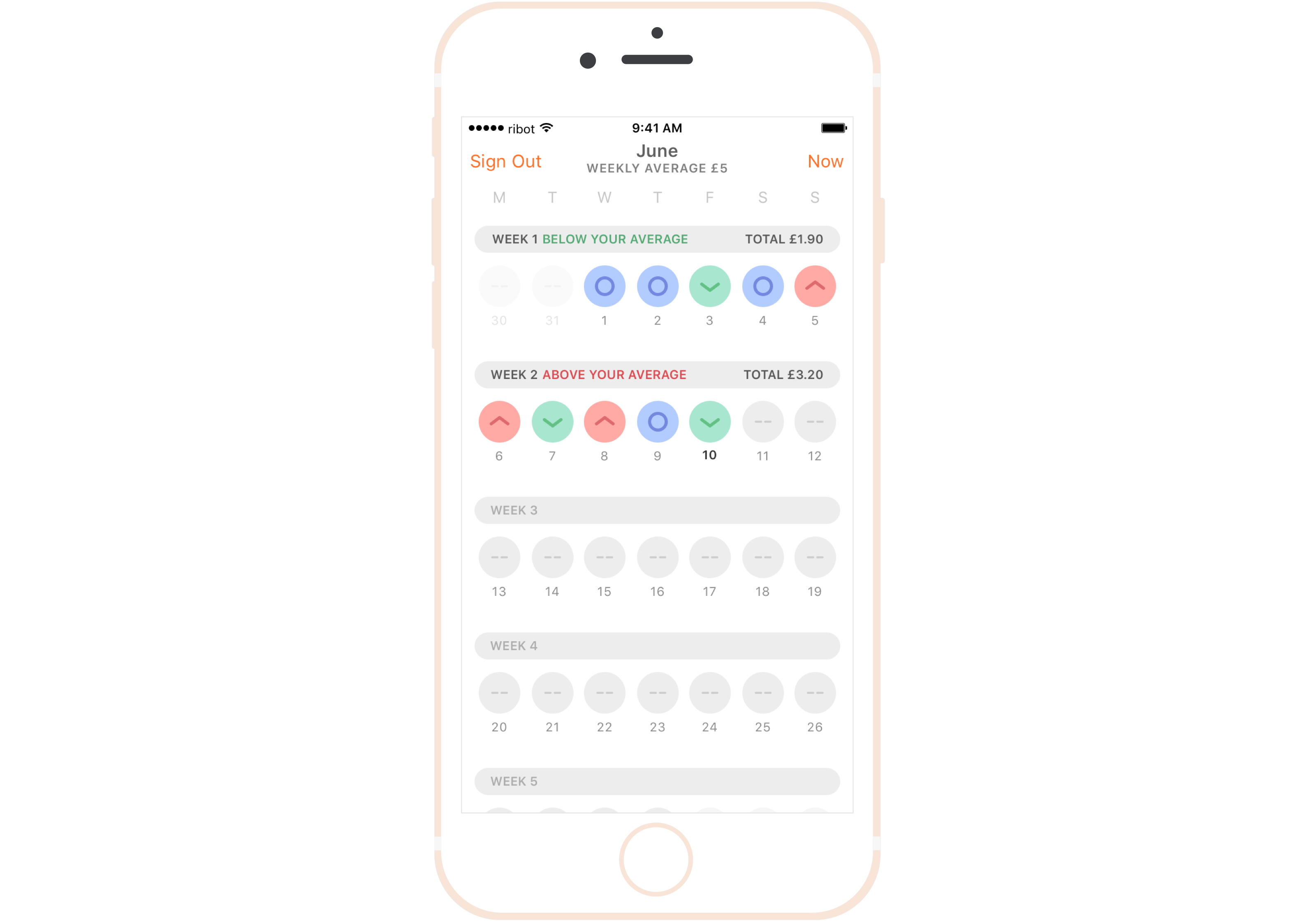
Benchmarking was a key component, allowing customers to understand their consumption in simple relative terms: above or below your average.
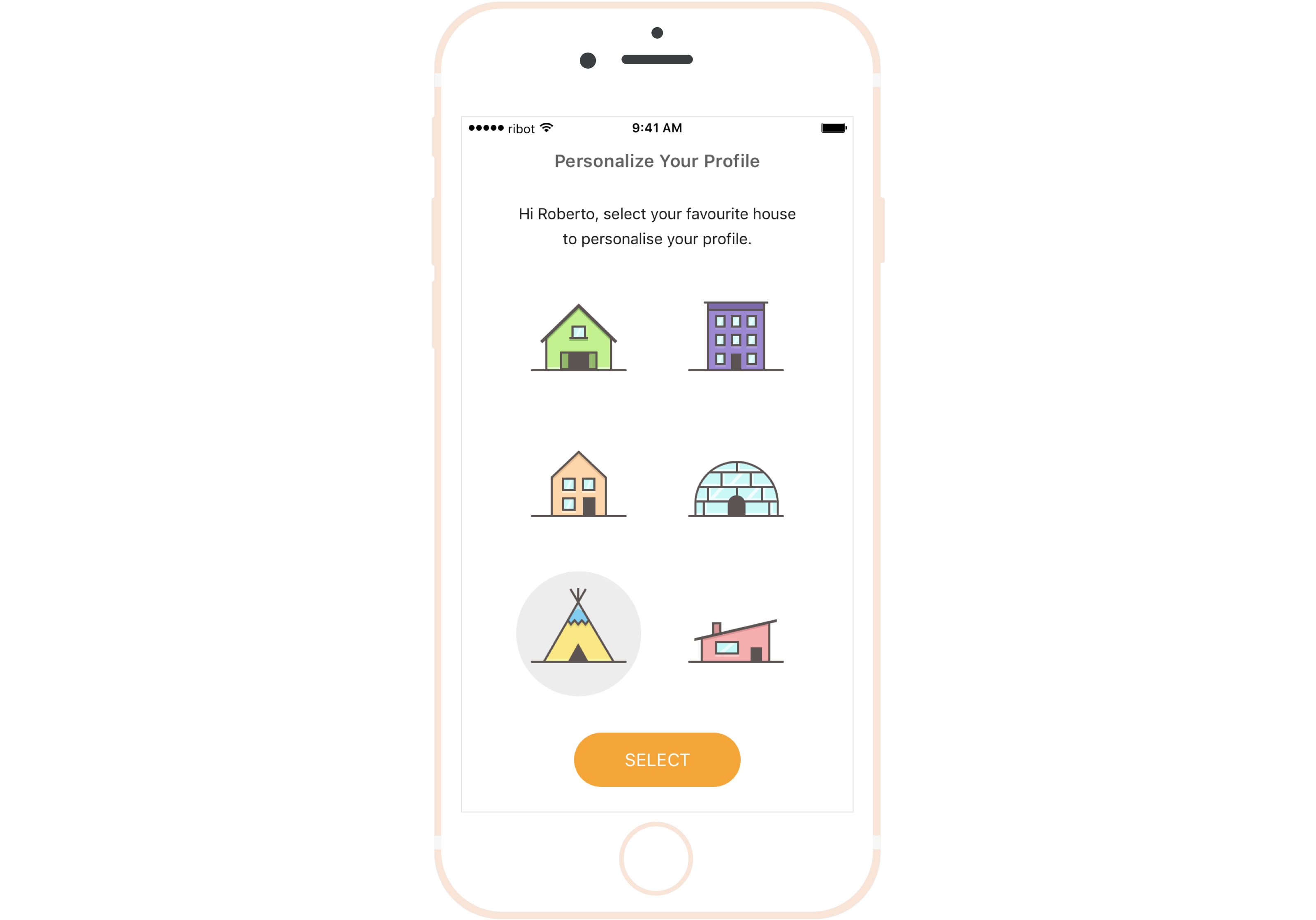
Personalisation was core to the app, energy usage benchmarking was done on an individual basis, and for emotional attachment, end-customers were able to personalise the representation of their home.
Lessons learned
Design Sprints are a great way to short-circuit the product creation process, and provide a sense of shared ownership.
Including senior stakeholders from infrastructure and operations in our discovery process was key to really understand the limitations, capabilities, and challenges ahead.
Energy consumption is deceptively simple, few customers actually understand what the numbers and units mean to them. Benchmarking was one way we found to focus less on numbers and more on the impact and value to customers.


