Weav Music is composed to sound good at varying speeds.
“The notation was merely a starting point – a great performer was expected to go beyond it.” (Clive Brown, Professor of Applied Musicology, "We're Playing Classical Music All Wrong", The Conversation)
Despite the millions of songs available to us, all of them are written and played in a prescriptive manner. Always the same note, always the same tempo, which makes them appropriate to only certain occasions and moods. As Clive Brown points out in the quoted article, this wasn't always the case.
“Tempo was often expected to be more flexible.” (Clive Brown, Professor of Applied Musicology, "We're Playing Classical Music All Wrong", The Conversation)
Before the 1930s classical music was flexible and that's what Weav Music is trying to bring back.
Weak music appeals to listeners, musicians and developers, here's why:
- Chilly—the musician—can simply define how his music sounds in those three or more scenarios.
- Jane—the listener—can play her favorite song while at home, working or running.
- Parisa—the app developer—supports Weav Music in her running app so Jane can listen to Chilly's music when exercising and enjoy it more.
The Job
I was hired to design the Weav Mixer Mac app for musicians to Weav(e) audio stemsaudiostems and tempo together.
The client is UK-based Cute Little Apps, founded by Elomida Visviki (Marketing veteran) and Lars Rasmussen (co-creator of Google Maps). Alan Cannistraro is an advisor for the company and known for his work on the original iPhone, iTunes and many top Apple apps, having recently left his role of Engineering Manager at Facebook.
The length of this project was of 2 (intense) weeks, working on-site.
Process and Tools
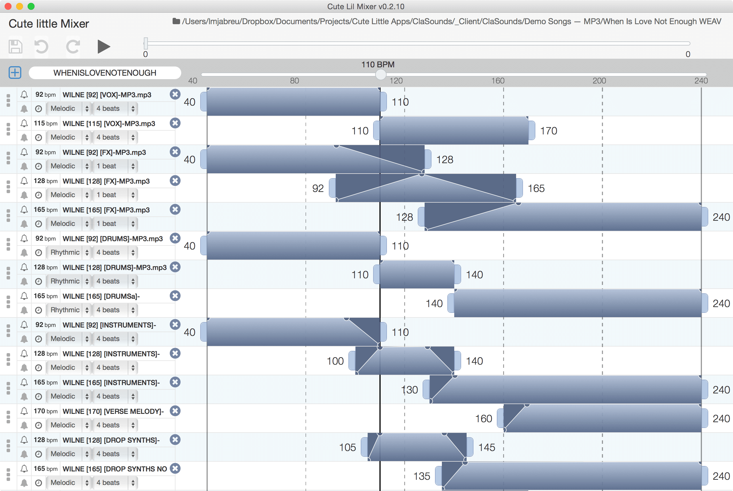
The Weav project had already been started by Elomida and Lars about a year before but had no definitive name. There was already a proof-of-concept Mixer, partner relations with musicians, interactive songs and plenty of insights.
The two weeks were focused on using the insights we had to: come up with the name (Weav); design the Weav Mixer and icon; direct the product website we'd use for our soft-launch.
Although I was hired to design Weav Mixer, I also helped steer the website towards a Jobs-to-be-done(JTBDjtbd) approach.
Jobs-to-be-done
Solely focusing on features described through walls of text is the surest way to loose customers.
In marketing, the best way to gain customer attention is to quickly clarify we're here to solve a problem they're having.
Weav Music offers 3 different jobs:
- Compose — Have more creative freedom and control over your music;
- Listen — Don't change your favorite song, change the mood;
- Integrate — Get more and happier customers through better music.
Displayed here in 3 mockups:
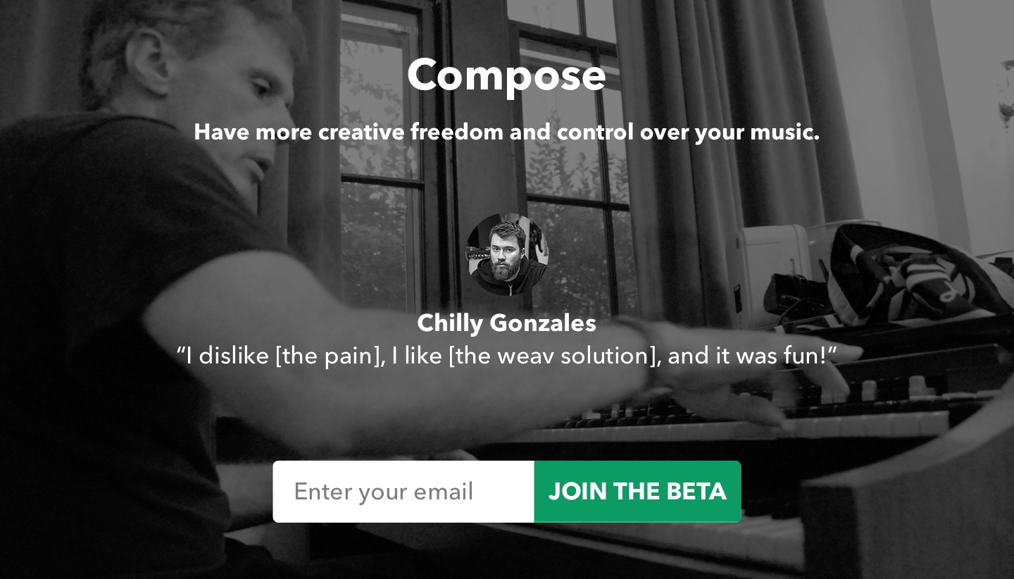
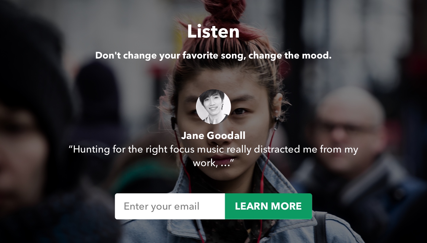

These describe the main job, provide Social Validationsocial-validation through small testimonials, which also help envision relatable use-cases, and a minimal input Call-to-Action for better conversion.
This is not the end of the journey for the customer, for providing their email, they're granted access to the beta group and a carefully crafted email would confirm their subscription and explain what will happen next, why, how to proceed and given it's an email, the customer is free to reply with any questions.
Production was handed over an external company, but some of these elements remained.
Weav Mixer
 {: .U-width--full}
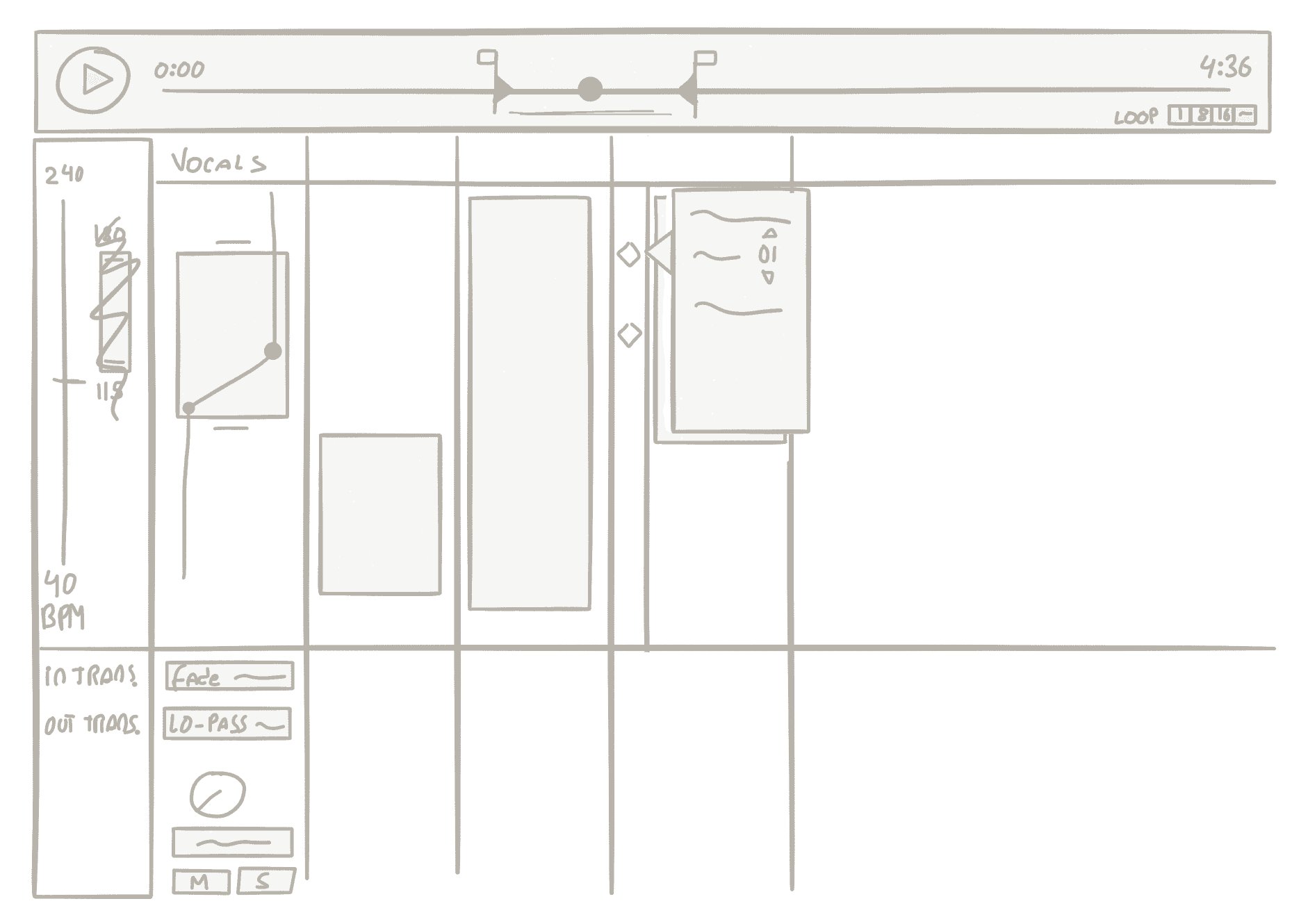
The Weav Mixer was my main job, over a few days the team (re)considered everything: what makes the music change, how does this work for musicians, what should the app look like, its name and more.
Wireframes
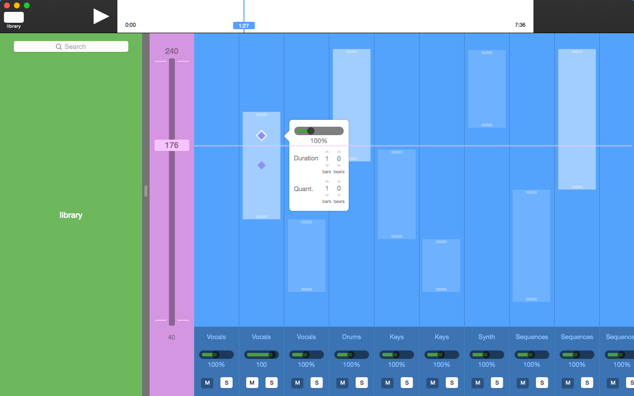
One of the very first wireframes (after sketching) included a media library to facilitate adding audio stems while keeping Weav in context—similar to professional authoring apps such as Final Cut Pro.
Visual Language
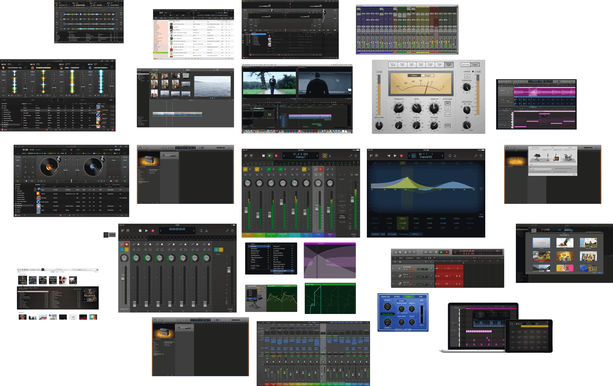 {: .U-width--full}
The app inherits the dark tones from other authoring apps—this reduces eye stress given the its long usage period.

Colors are used only to distinguish stems and have been carefully selected to be color-blind-friendly.
The major difference is that we did not inherit the skeuomorphic knobs and sliders seen in other apps, Weav embraces the digital nature of interactive music instead.
Weav Icon
![]() {: .U-width--full}
{: .U-width--full}
The Weav Icon incorporates elements interweaved stems seen in the app used for background, their intersection simultaneously forms a sine wave the initial letter from the app's name.
Outcome
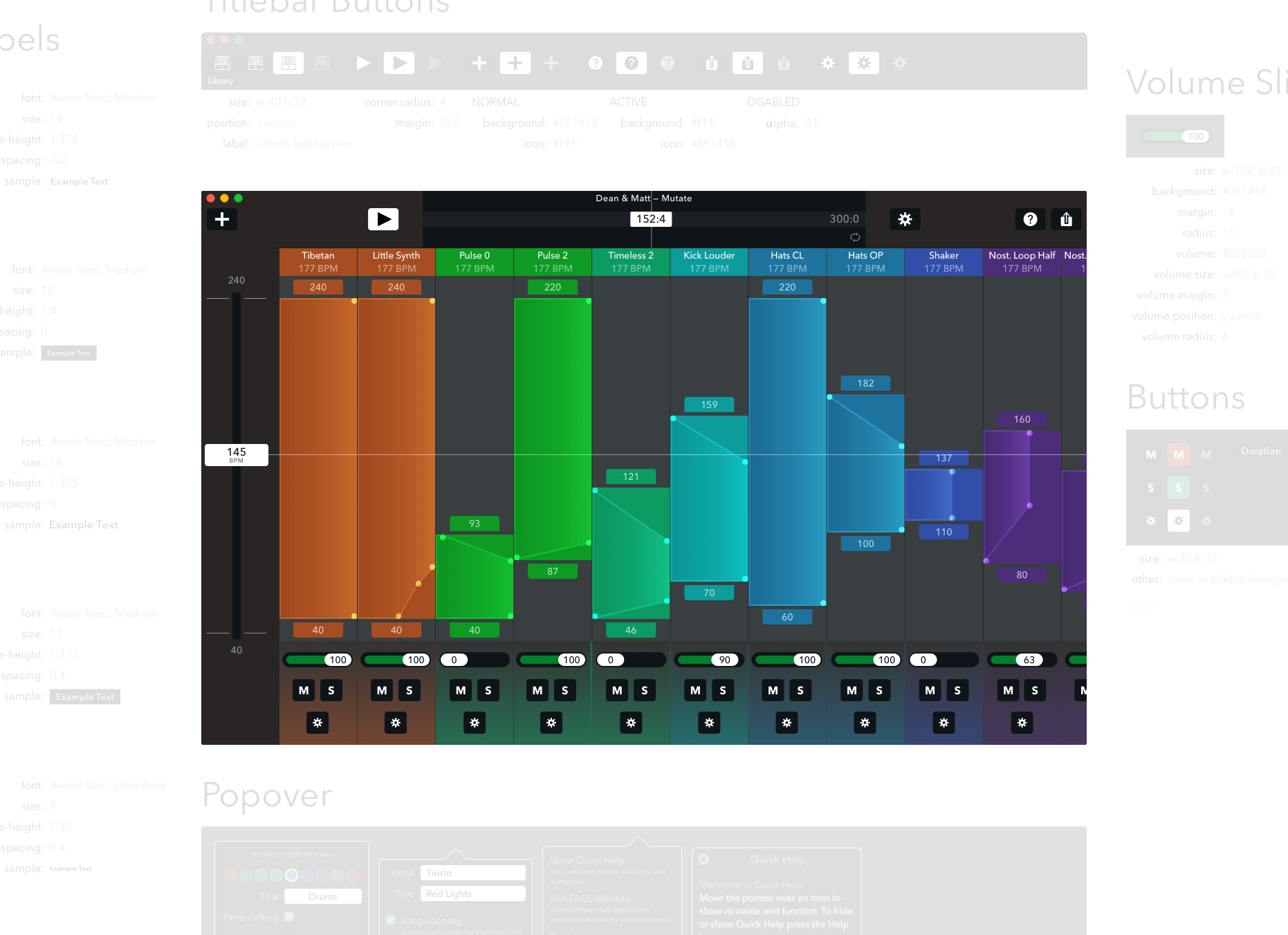 {: .U-width--full}
The outcome of this project was the beta Weav Mixer, along with documentation, and developer-ready assets.
This project was a slight detour from iOS apps and product design but fun nevertheless. Check out their website and signup for the upcoming updates.
- audiostems: Audio Stem: term used to describe groups of instruments such as drums, vocals, synth, etc.
- jtbd: Jobs-to-be-done: if you’re unfamiliar you can read more about it at the Intercom blog or watch a 5 minute intro by Clayton Christensen, professor at Harvard Business School.


